
Harholdt
Building a compassionate brand for a modern mediation and law practice
The Project
For Harholdt Mediation and Law, Hiarki partnered to develop a cohesive and strategically grounded brand identity that bridges legal authority with human-centered empathy. The project’s mission was to unify the firm’s multifaceted offerings including mediation, legal practice and education into a single, resonant visual and experiential expression that instills calm, trust and confidence among clients navigating sensitive personal matters.
Services
Creative & Design
Consultation
Brand Strategy
Brand Design
Marketing Assets
Project Details
Industry:
Legal Services
Timeframe:
3 months
The Challenge
Harholdt Mediation and Law required a brand that could communicate both professional authority and deep empathy, especially given the delicate emotional contexts of mediation and divorce. The existing perception was fragmented, with diverse services and experiences that lacked a unified identity. This complexity demanded a thoughtful brand strategy that would simultaneously convey trustworthiness, warmth and clarity without appearing overly legalistic or impersonal.
The Process
The client, the founder of Harholdt Mediation and Law, had built a multifaceted career in law, mediation and teaching mediation. Through initial strategy workshops with Hiarki, a clear path emerged to create a parent brand that could house the diverse pillars of the business, setting the foundation for a brand that is coherent, resonant and aligned with the business's vision and objectives.
1.0 Frame
The value
In this foundational phase, we immersed ourselves in the intricate world of Harholdt Mediation and Law, striving to comprehend its multifaceted essence and the nuanced equilibrium it aspired to achieve. Our journey involved meticulous research and enlightening discovery sessions, where we unearthed the fundamental values and goals of the firm.
This exploration allowed us to align these elements, forming a brand blueprint to navigate future endeavors and expansions. The approved moodboard, a culmination of our exploration, inspired the design, visualized the brand’s purpose and look-and-feel. As a result, reflecting Harholdt’s mission of reconciliation, communication and authority. It was a pivotal step in shaping the brand’s personality, ensuring coherence in its appearance, tone and behavior.

First collaborative session with the client at a local café. We focused on understanding Harholdt’s values and vision, and laying the groundwork for strategic alignment in design to craft a brand resonating with trust and empathy.
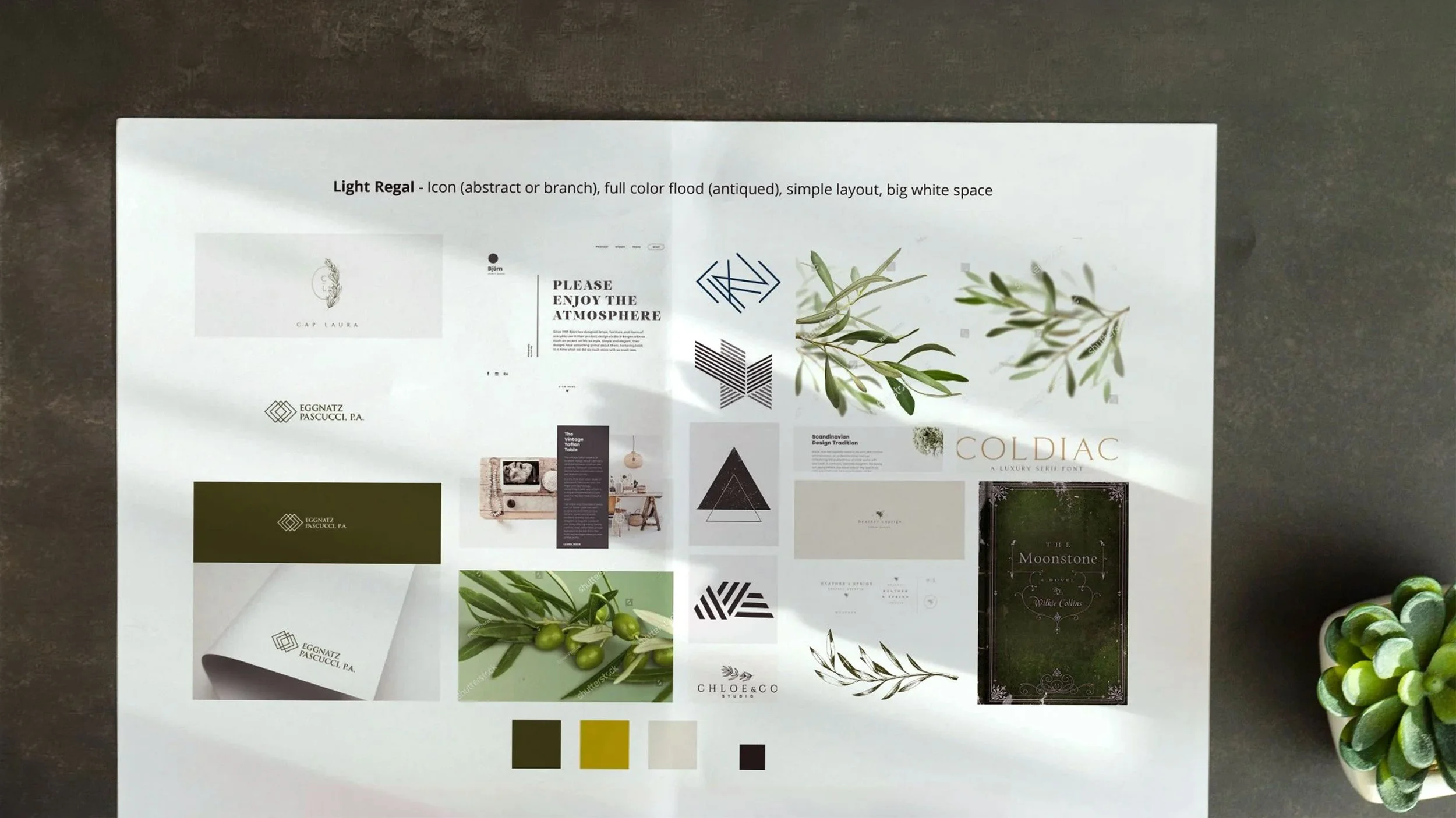
Client-approved moodboard, a visual representation of Harholdt’s values and mission and serving as a design compass for crafting a brand that embodies trust, empathy and strategic alignment in design.
2.0 Form
The design
Transitioning to the design phase, our task was to morph the values and objectives identified in Phase 1 into tangible visual elements. The initial inclination was towards an abstract mark, but our research and workshops underscored the significance of industry symbolism to the clientele. We, therefore, embraced these symbols, synthesizing a logo that harmoniously integrates several symbols representative of mediation and law.
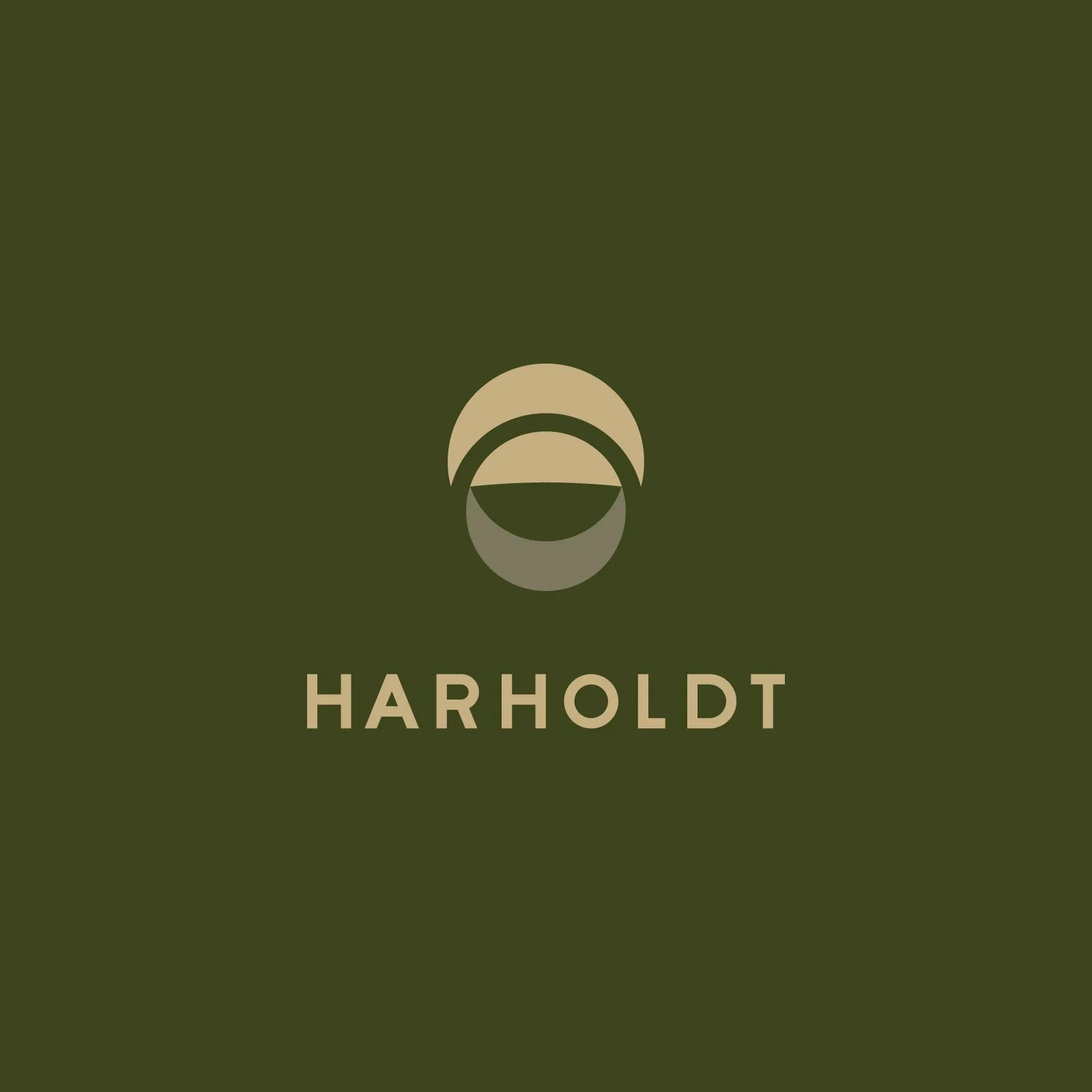
In this phase we emphasized creating calm and cohesive visuals that seamlessly integrate the overall look-and-feel of the brand, ensuring the design resonated with Harholdt’s mission. The outcome was a set of three visual cues within the brand, each encapsulating the essence of Harholdt’s mission, forming a visual narrative that is both calming and authoritative.
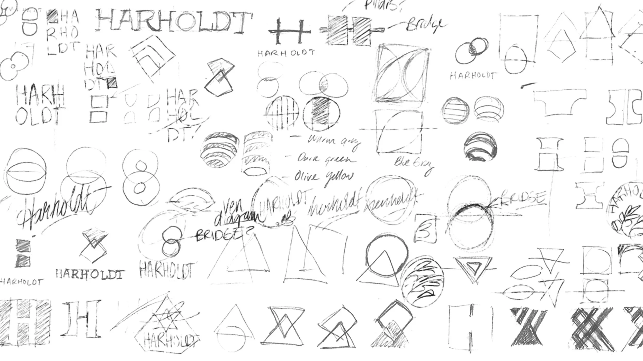
A series of initial logo sketches by Hiarki, each one a blend of innovation and strategic alignment, reflecting our commitment to design for visionary businesses and create a lasting impact in the design landscape.
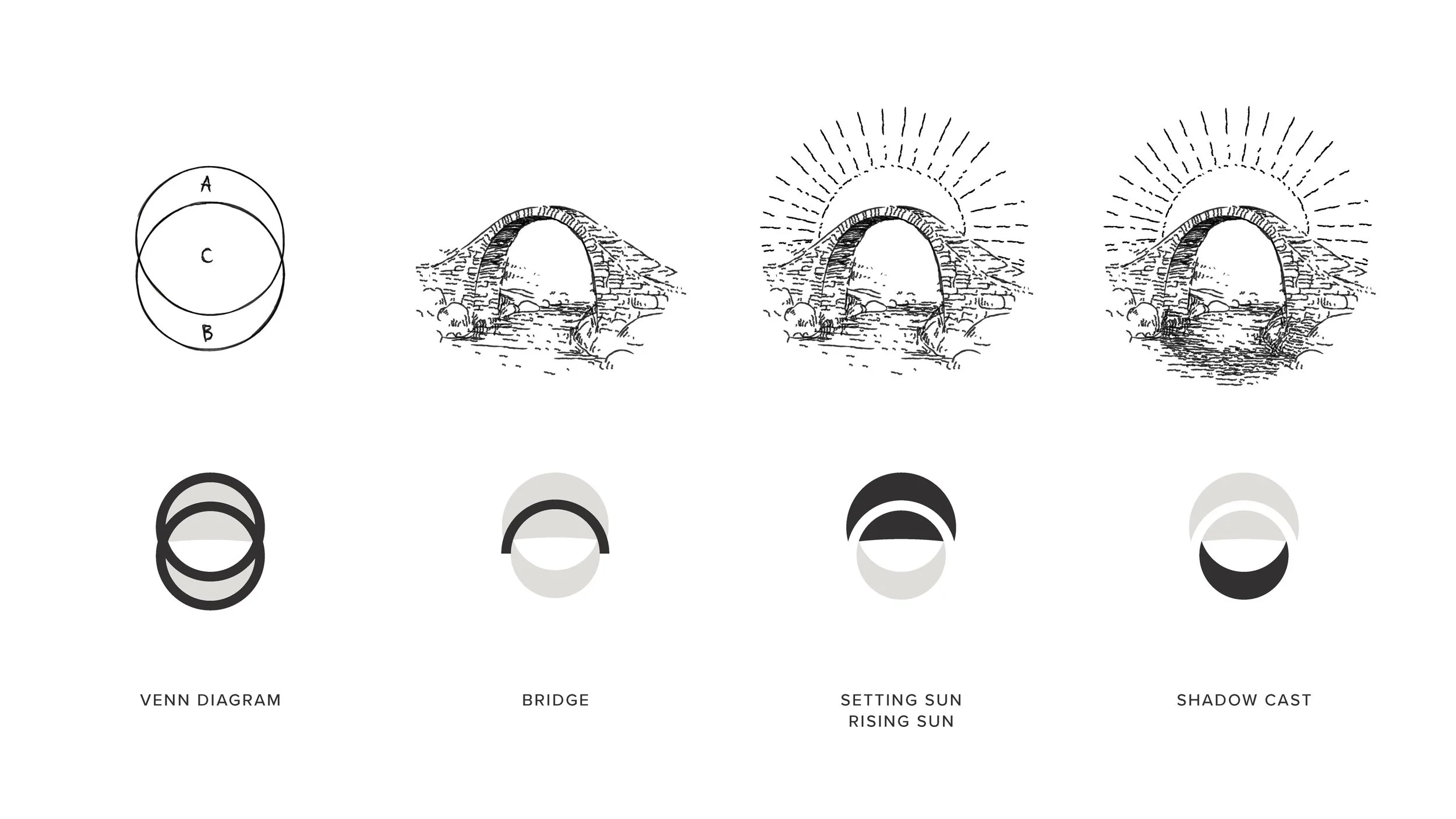
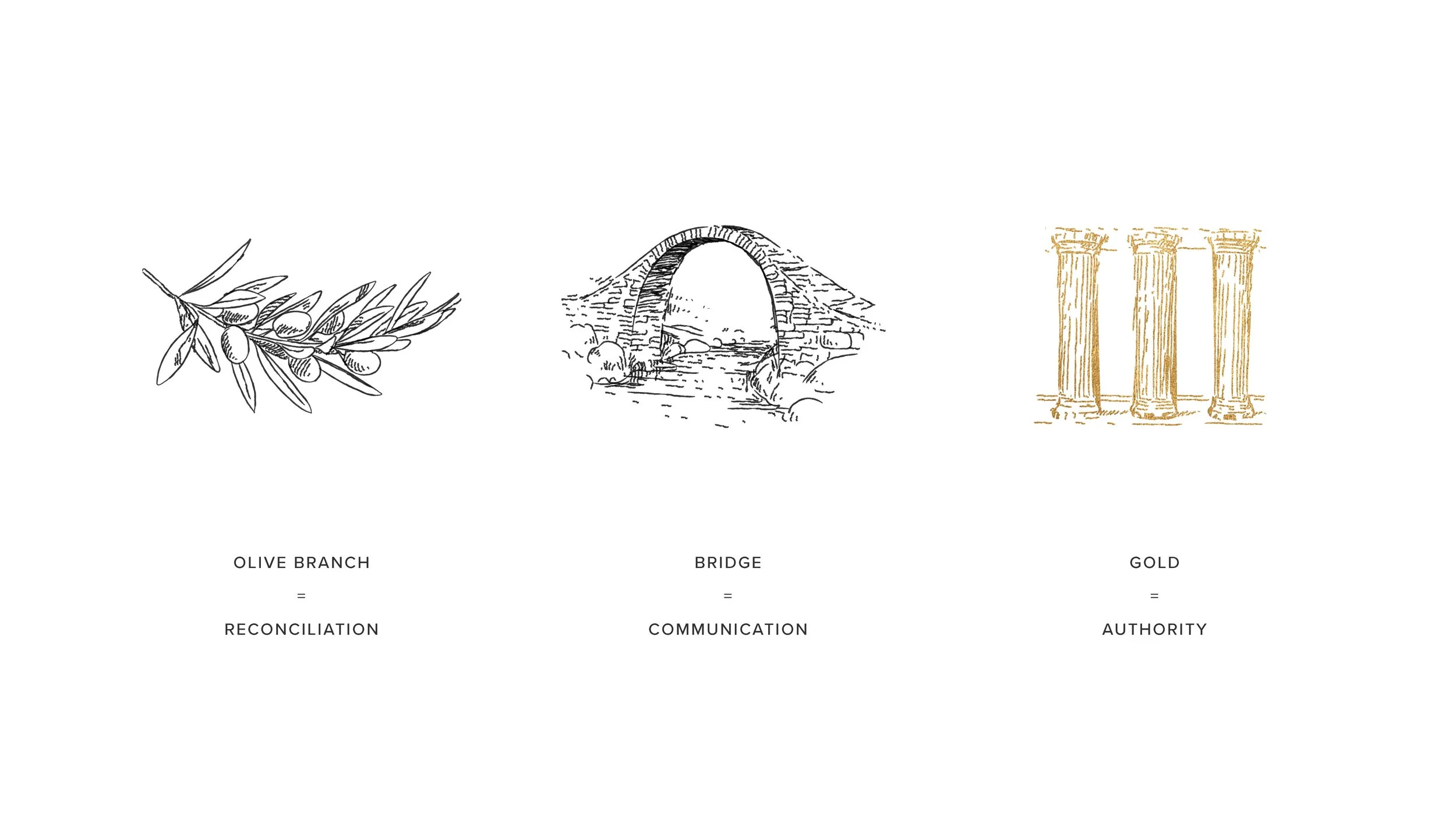
A detailed breakdown of symbolism in Harholdt’s final logo illustrates Hiarki’s meticulous approach to melding insights from Phase 1 with innovative design, effectively echoing Harholdt’s mission and values in mediation and law.
3.0 Fulfill
The brand system
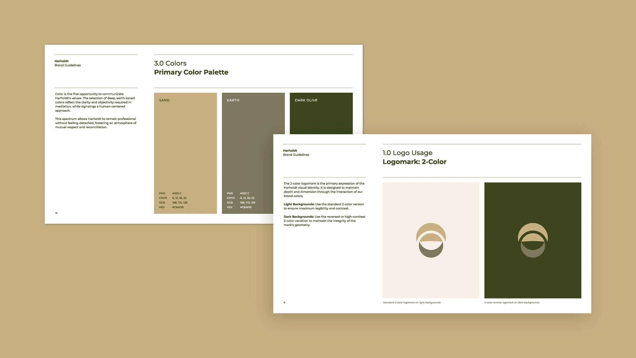
In this final phase, we meticulously shaped the brand expression, ensuring that every component, from the colors to the fonts, resonated with Harholdt’s mission of calm, respect and authority. We developed an ID Guideline, a succinct summary encapsulating all the brand elements, designed to guide effective future implementations of the brand.
This guideline acts as a navigational tool, steering the brand’s journey and ensuring the consistent and accurate communication of its essence. After detailed development and securing the client’s approval, we organized all assets for hand-off, ending with a strategy meeting to review and consult on the brand’s deployment. This phase was crucial in fortifying the brand's voice, ensuring it spoke clearly and resonated deeply with its audience.
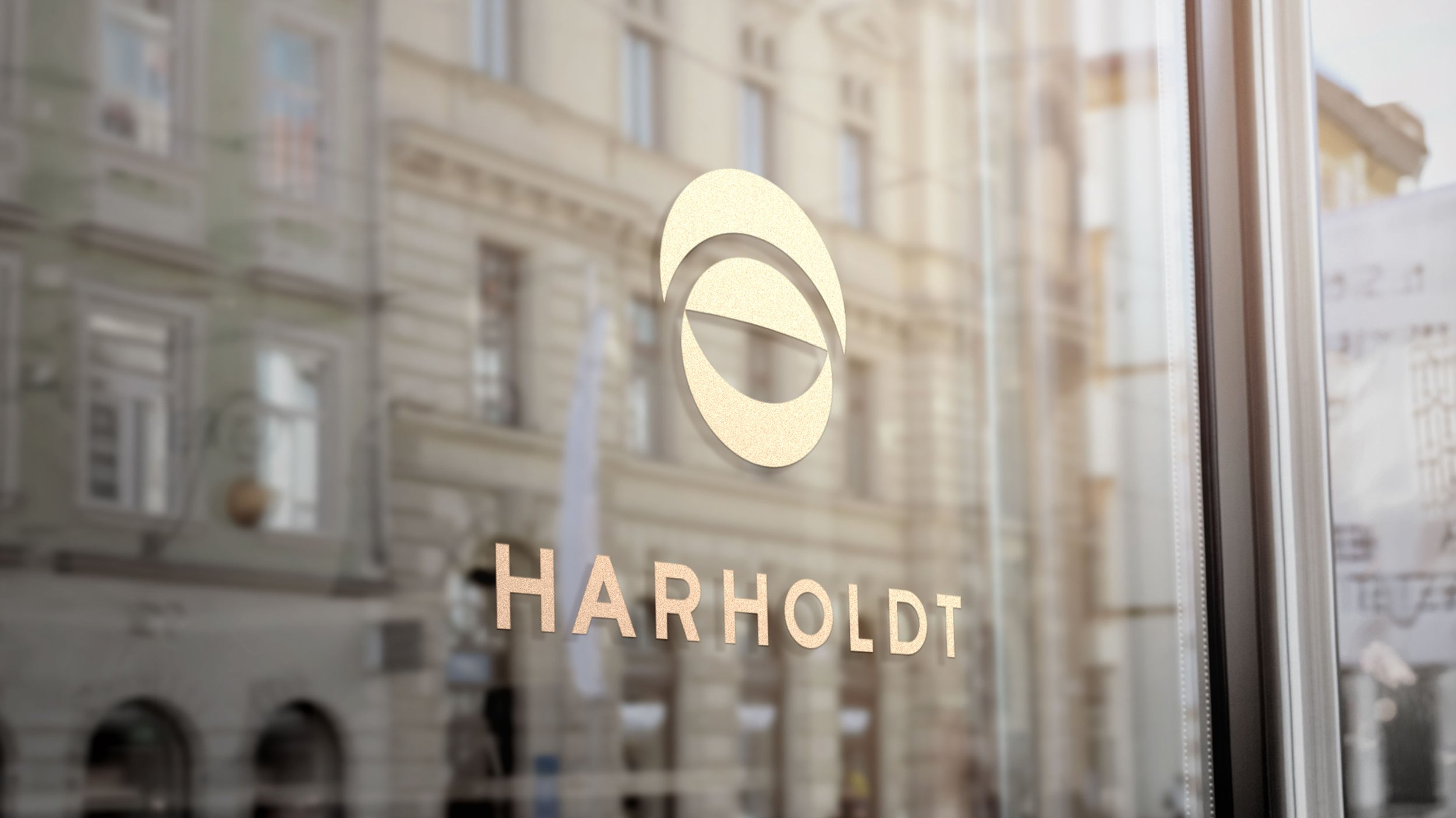
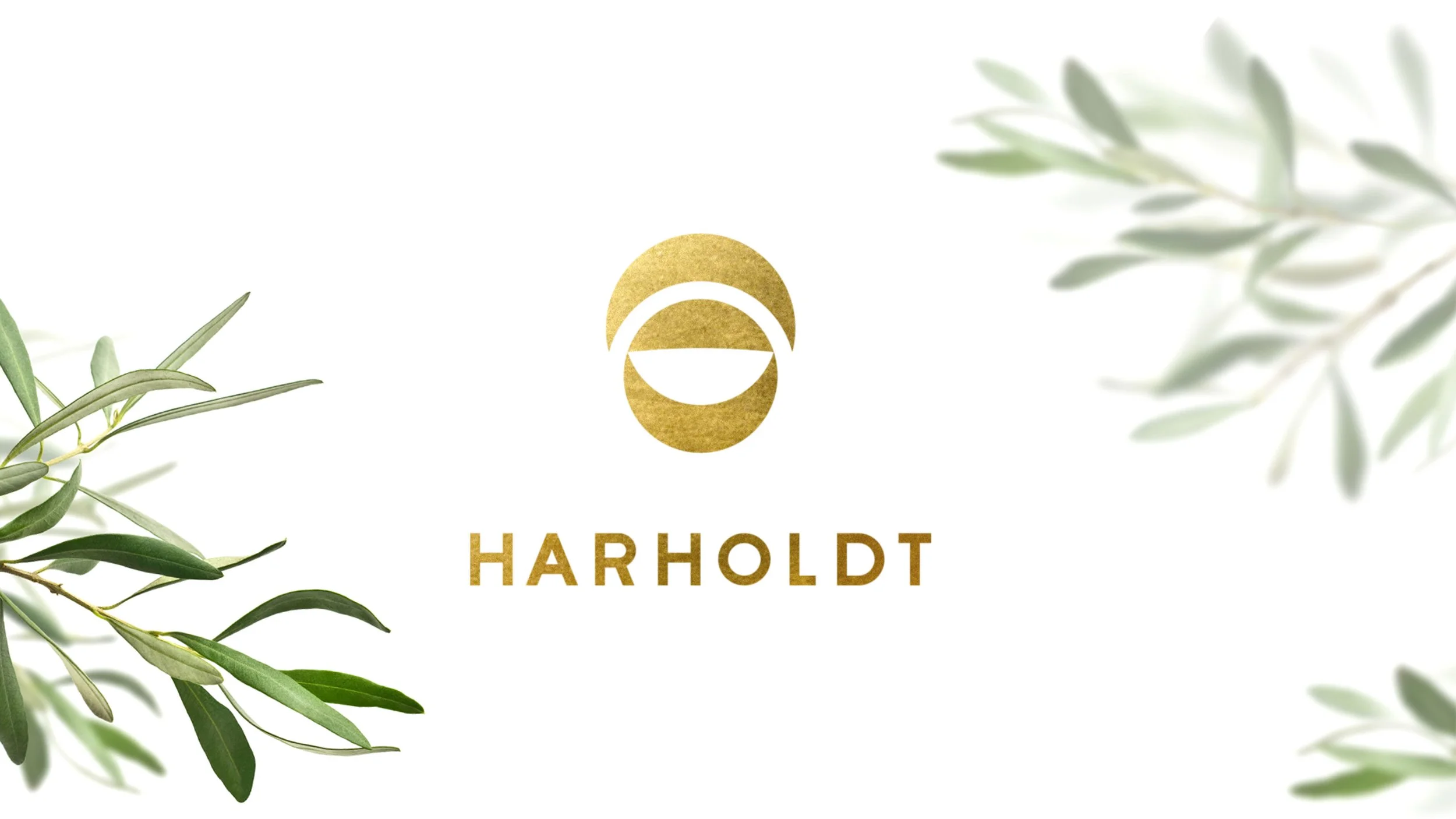
The final logo epitomizes the elegance of minimalism. The result is the culmination of the client’s and our effort to create a mark that is both memorable and simplistic, resonating profoundly with Harholdt’s mission in mediation and law.
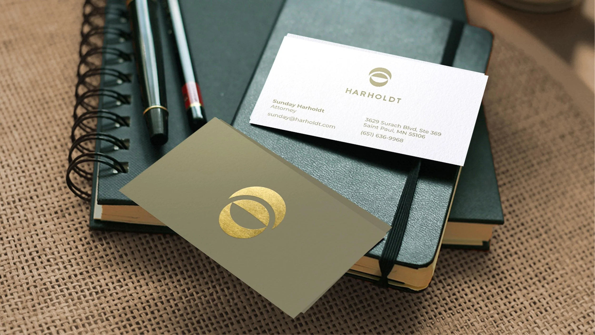
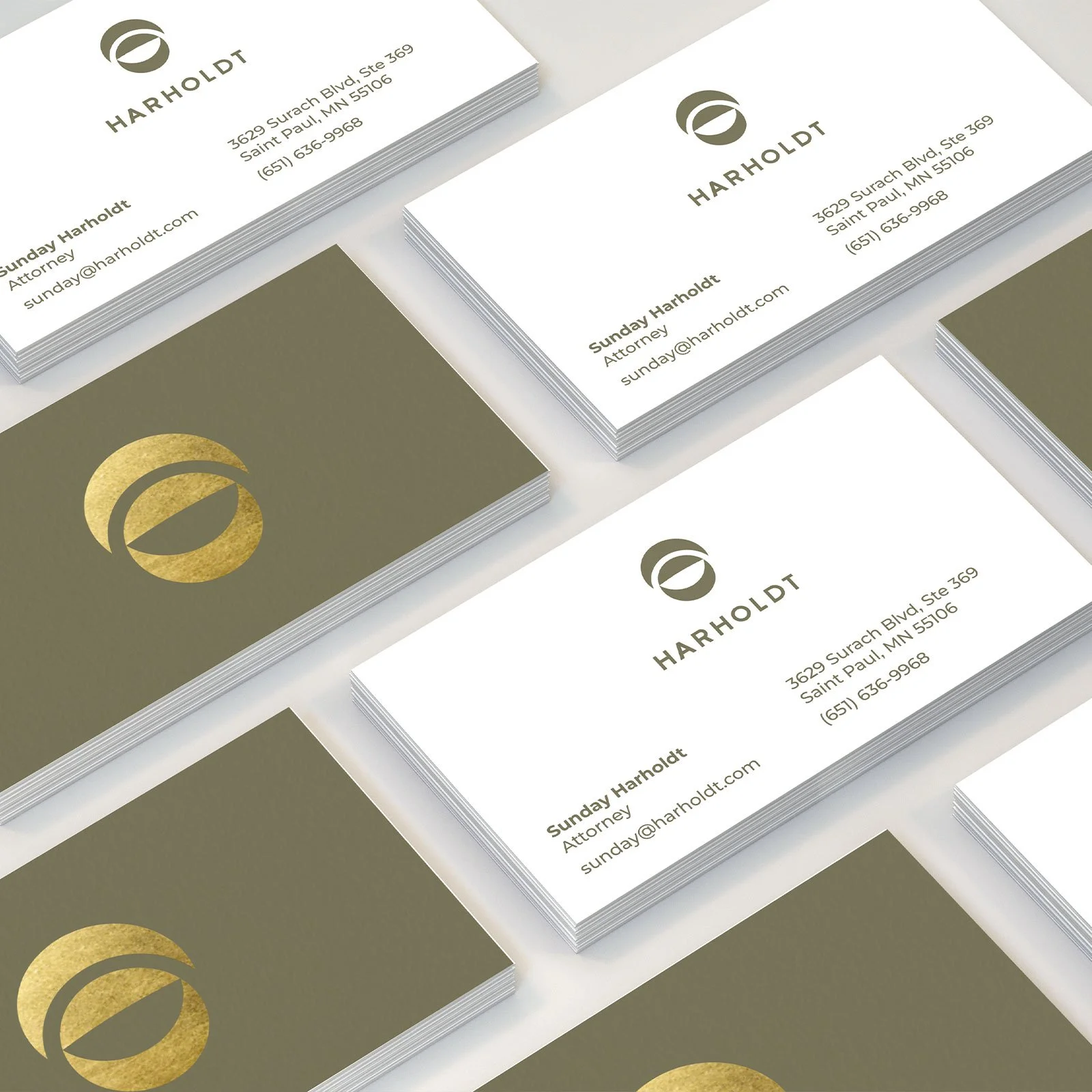
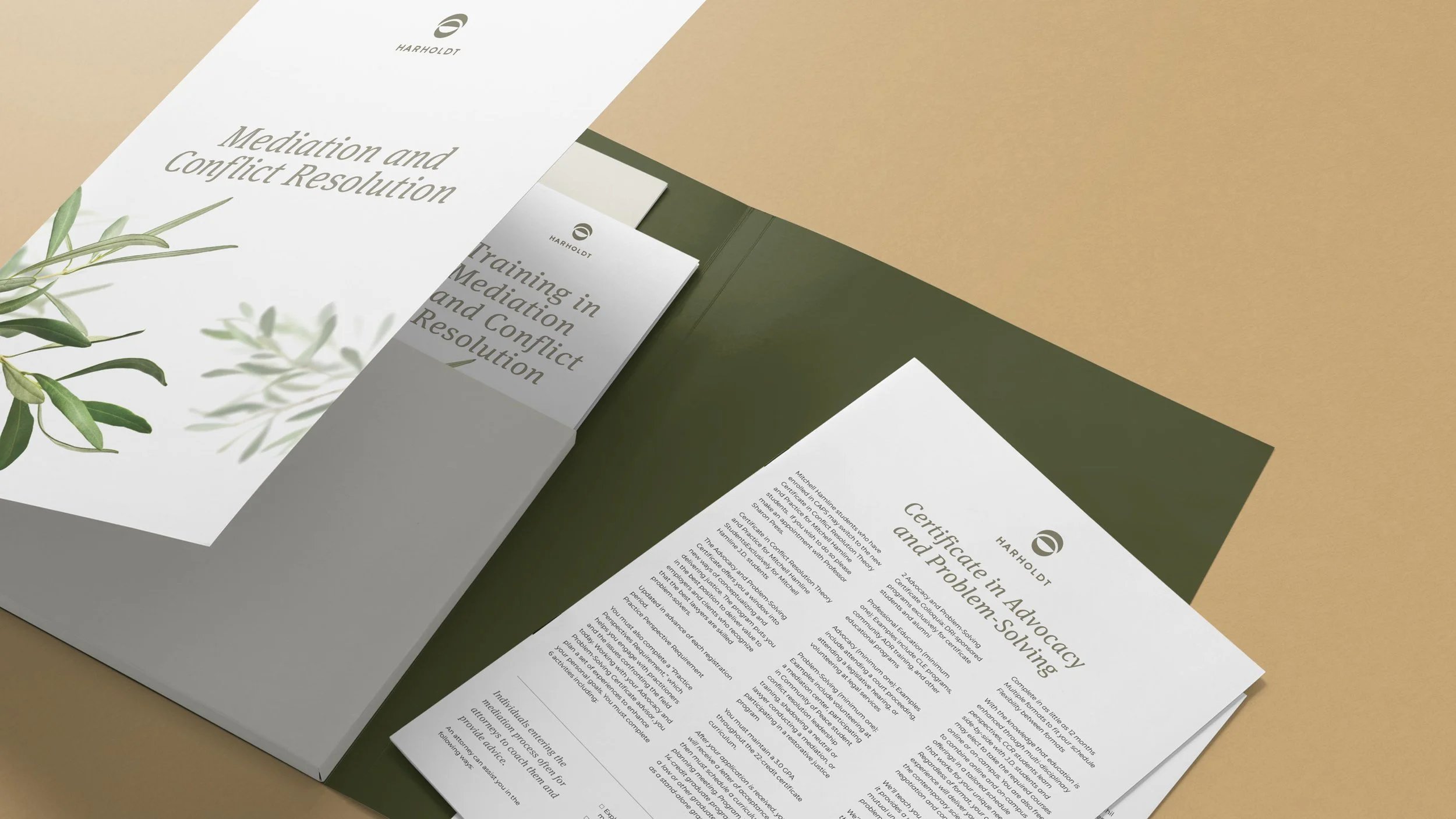
The brand’s refined identity, showcased on business cards and sell sheets, embodies Harholdt’s values and mission with clarity and conciseness. With the supplied ID Guideline, this cohesive look can be seamlessly applied to all marketing materials.
The Outcome
The collaboration produced a strategic and cohesive brand system that artfully integrates legal symbolism with calming design elements.
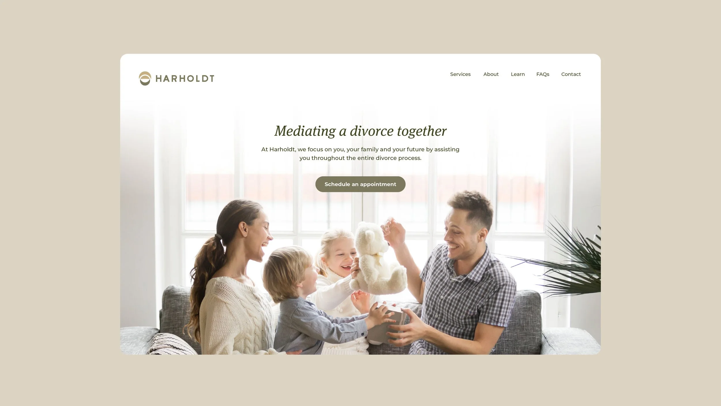
This included a distinctive logo, refined messaging and versatile visual assets that support marketing, client communications and future business growth. The new brand not only resonates with individuals in vulnerable situations, but also strengthens professional credibility, setting Harholdt apart in a traditionally rigid sector with a more compassionate, tailored presence.
The journey with Harholdt Mediation and Law was a testament to the transformative power of design, where diverse elements were woven into a cohesive, resonant brand. It was a journey of discovery, innovation and alignment, resulting in a brand that is a true reflection of Harholdt’s values and purpose for the business. The joy and satisfaction experienced by the client, witnessing her diverse career paths unified under one robust brand, were the true rewards of this project, highlighting the impact of strategic, thoughtful design in bringing visions to life.
Next Project
Looking for a design partner?

If you’re working on a project where brand, architecture, and experience need to align, we’d love to collaborate.