
Post Consumer Brands
Turning a refreshed headquarters into a cohesive brand experience
The Project
When Post Consumer Brands completed a refresh of its headquarters, the challenge was not simply to add graphics but to create a more coherent brand experience across the campus.
Working alongside RSP Dreambox, Hiarki helped define the plan of attack, shape the experiential framework and translate strategy into actionable design systems, spatial decisions and implementation thinking. Building on brand elements already established by Post Consumer Brands’ agency and other partners, the collaboration produced an environment that feels more cohesive, intentional and aligned with how people move through the space.
Services
Experiential Strategy
Discovery and spatial audit
Circulation and path mapping
Audience and zone definition
Environmental Design
Interior color strategy
Expanded iconography system
Photography direction
Spatial graphic integration
Spatial Experiences
Entry and arrival experience
Corridor activations
Conference room murals
Huddle room graphics
Document & Fulfillment
Fabrication coordination
Technical specifications
Experiential design guideline
Project Details
Project Lead:
RSP Dreambox
Collaborating Studio:
Hiarki
Industry:
Consumer Packaged Goods
Timeframe:
24 months
The Challenge
Post Consumer Brands’ recently renovated headquarters did not yet feel like the brand. While portions of the headquarters already reflected the brand, the experience remained uneven across the campus and lacked the clarity and cohesion needed to tie movement, messaging, and place together.
The challenge was not to decorate the building. It was to translate a living brand into a spatial system that reflects how people move, gather and work. The environment needed to feel intentional, legible and energized while working within the constraints of an already completed interior.
The Process
This project began the way many experiential collaborations do: with translation. The architecture was built, the intent was there, but the feeling hadn’t arrived yet. We started the same way: walking the space together and talking about what the brand wanted people to sense before they even reached reception. That first visit wasn’t about critique; it was about curiosity. What story was this building trying to tell and how could we help it speak more clearly?
1.0 Frame
Reading the building through movement and use
We started with immersion: walking the space, observing daily traffic and documenting how people naturally used it. Front entrances, employee routes and executive paths were all mapped to understand where attention landed and how flow could guide design. This foundation revealed not only how the building worked, but also where it fell short, which helped us identify zones of visibility, rhythm and pause.
We audited existing brand materials, interior finishes and environmental conditions. From there, strategy sessions defined what the space should communicate: optimism, vitality and a sense of forward motion, all grounded in Post Consumer Brands’ consumer energy but scaled for a workplace environment.
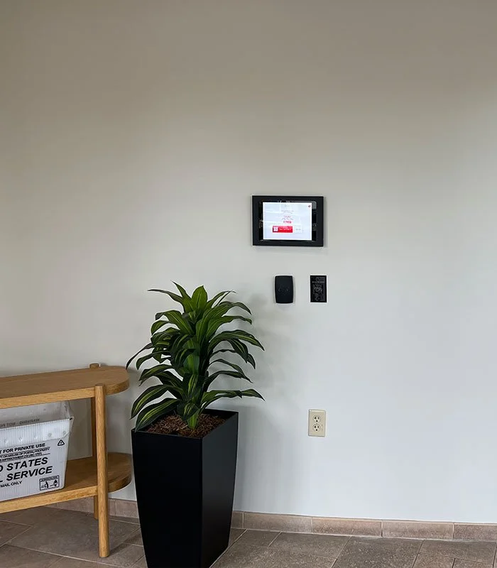
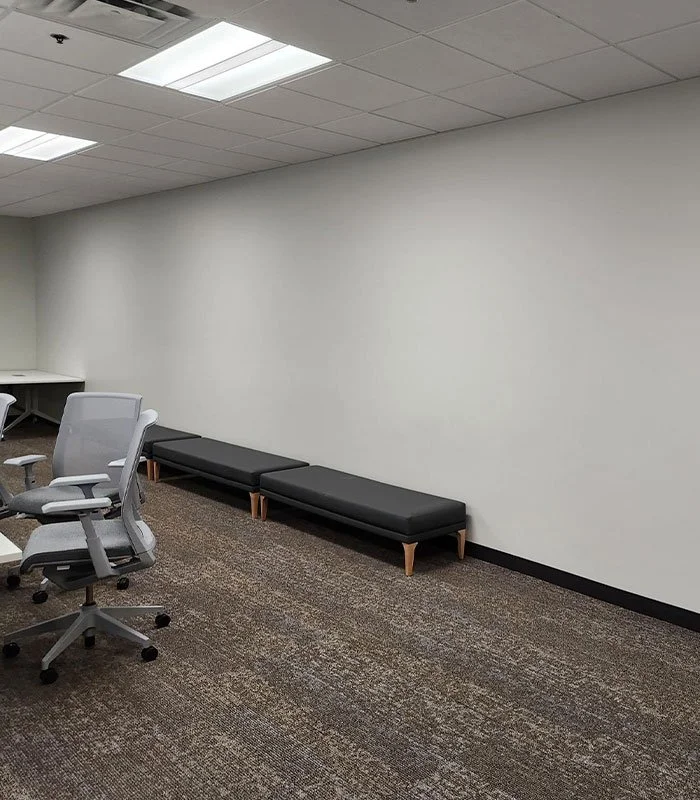
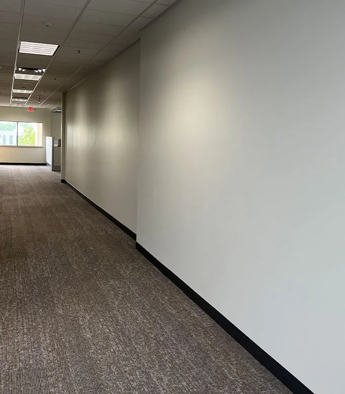
Early views of the headquarters interior highlight the unactivated surfaces that later became opportunities for environmental graphics, brand storytelling, and large-scale visual interventions.
2.0 Form
Translating insight into a spatial narrative
This was the moment when the thinking became form. The insights from our circulation studies, zoning, and user profiles were translated into a spatial narrative that could guide every decision moving forward. We began shaping how the brand should feel as people moved through the building, what tones should rise or recede and how visual rhythm could help organize an irregular architectural footprint.
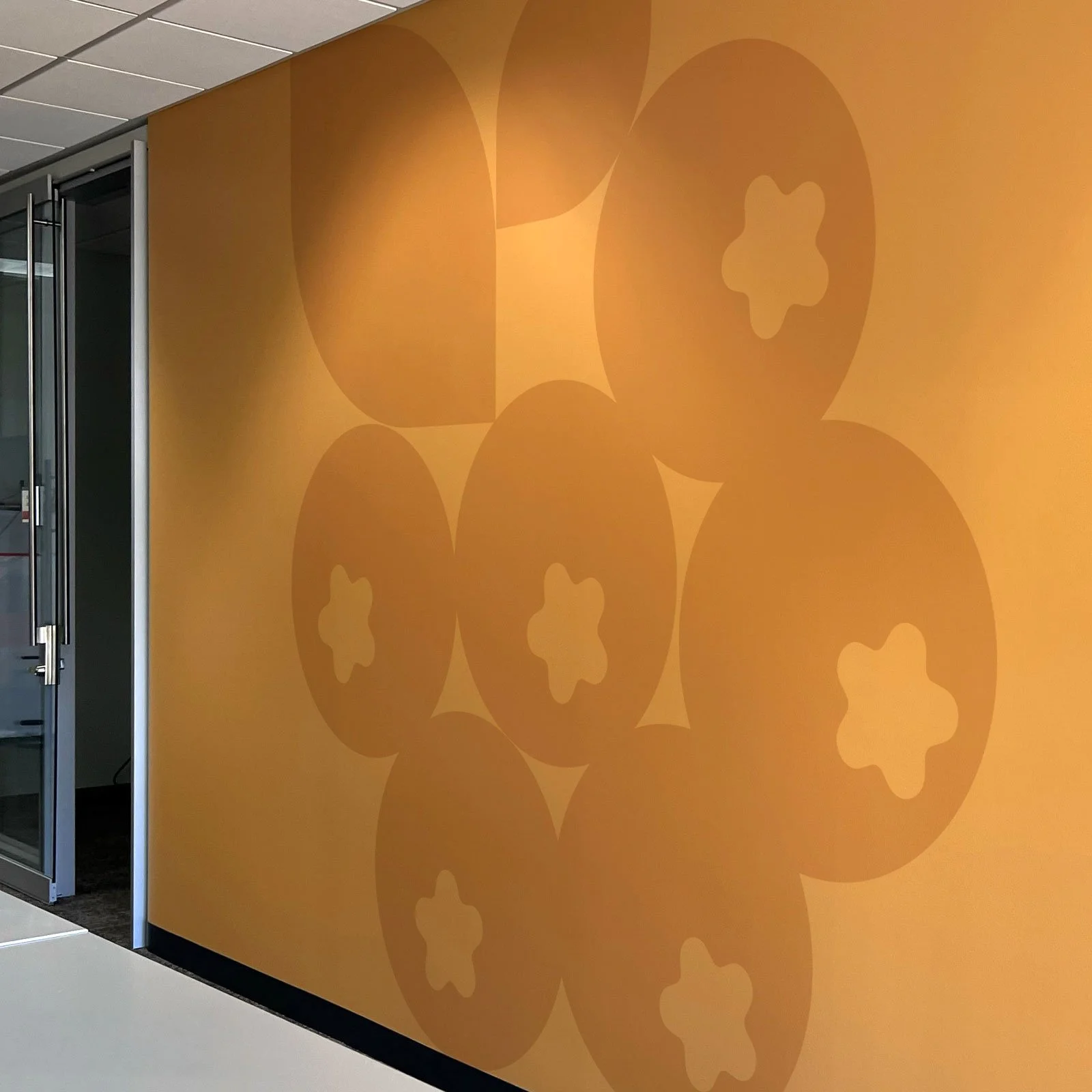
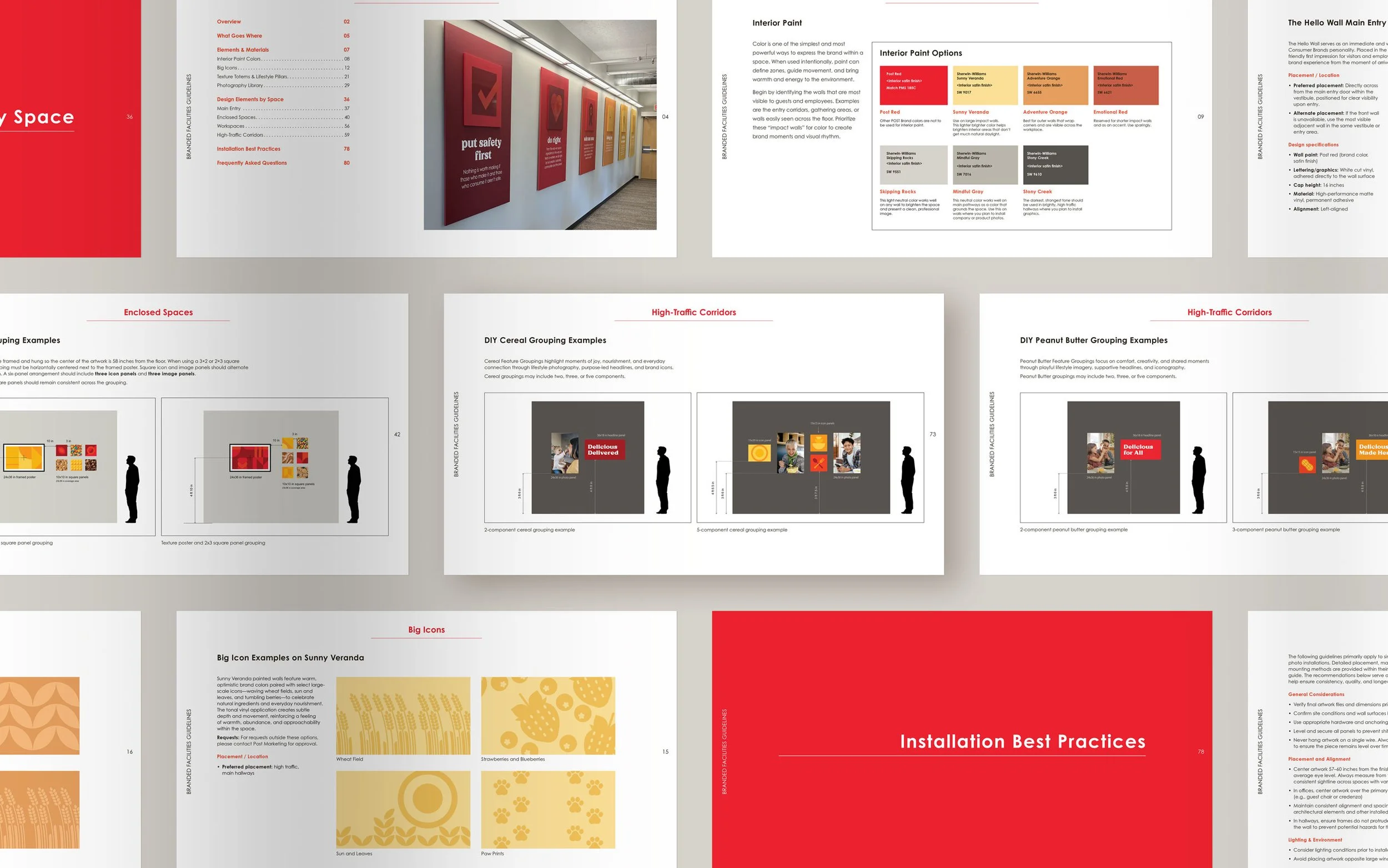
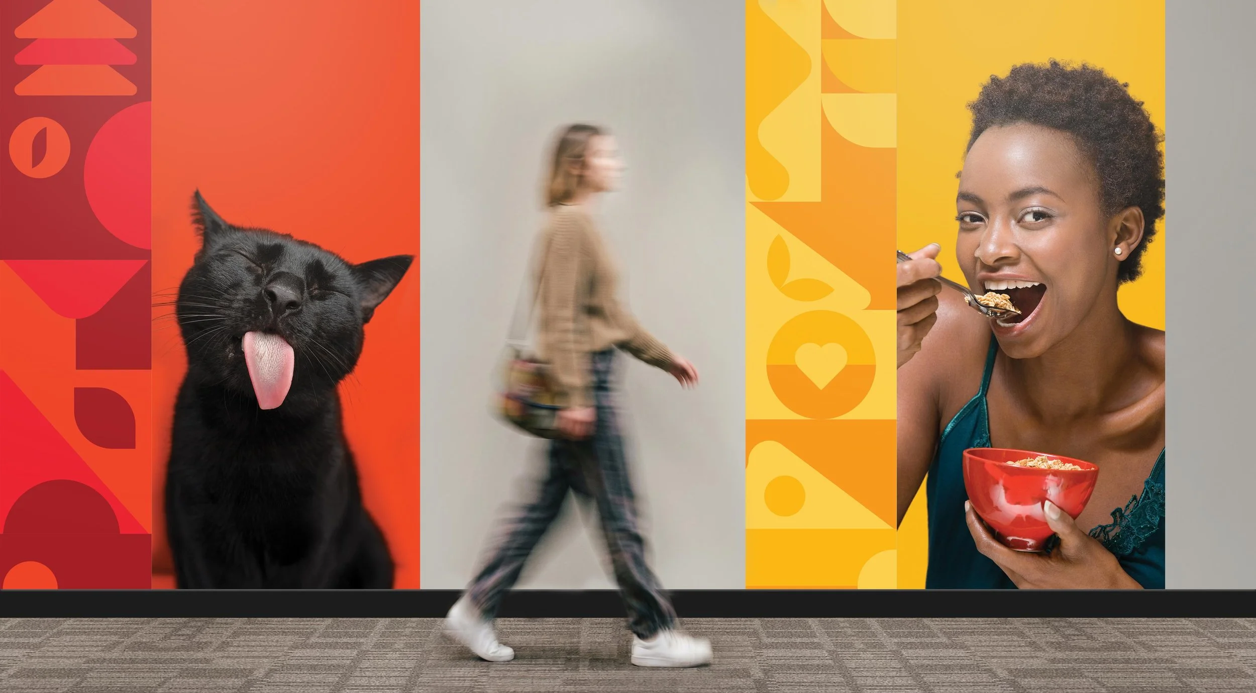
We refined the interior color palette to create harmony and calm. We expanded the iconography system so the visual language could flex across scales and contexts. We built a photography strategy that balanced motion with intimacy, depending on how each space was used. All of this work created a clear directive for what the environment needed to express, not just what it needed to display.
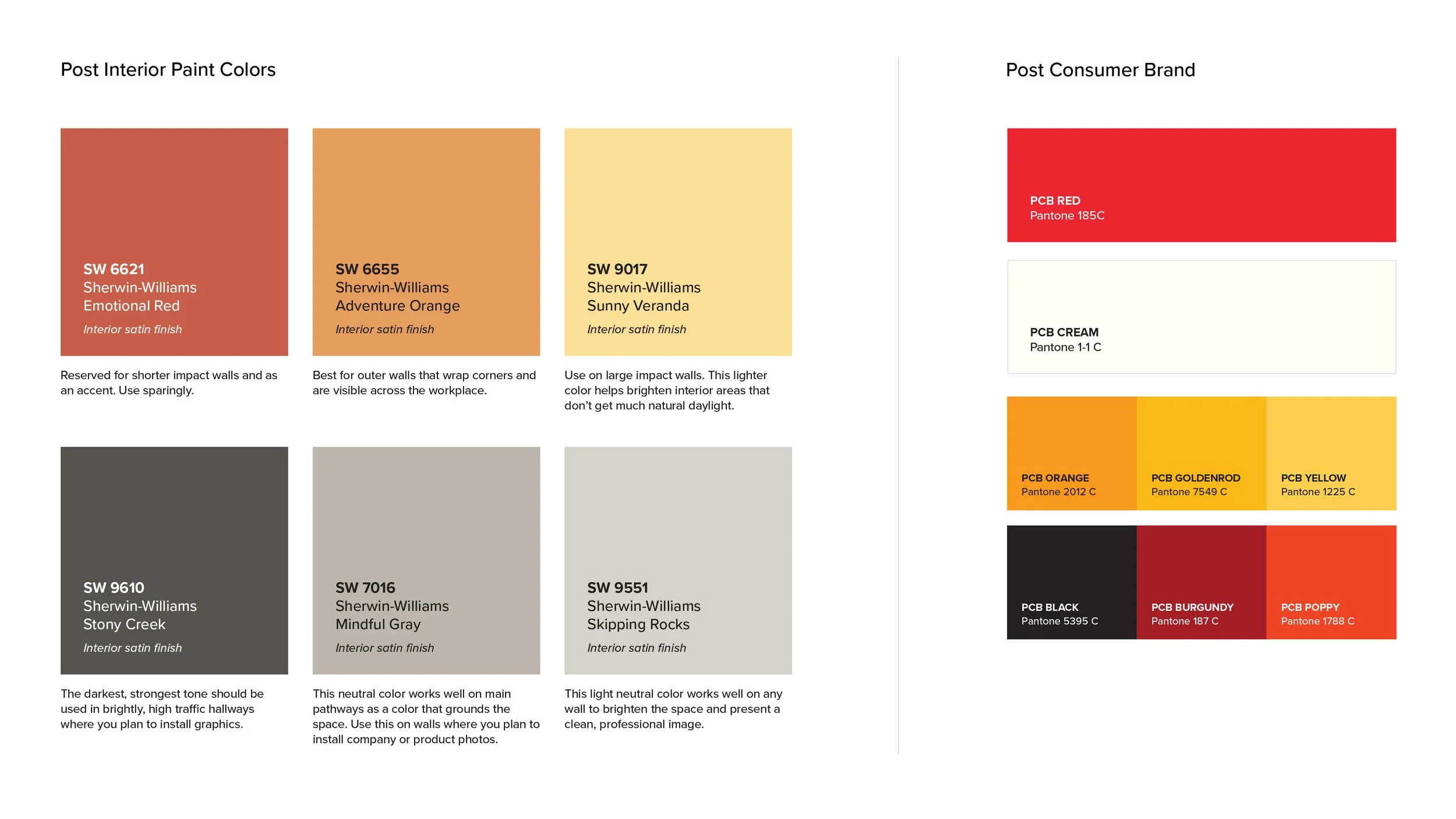
Hiarki helped develop this interior paint plan to complement the existing Post brand identity. By selecting a suite of Sherwin-Williams tones, we created a workplace palette designed to enhance employee mood and define functional zones while staying true to the established brand experience.
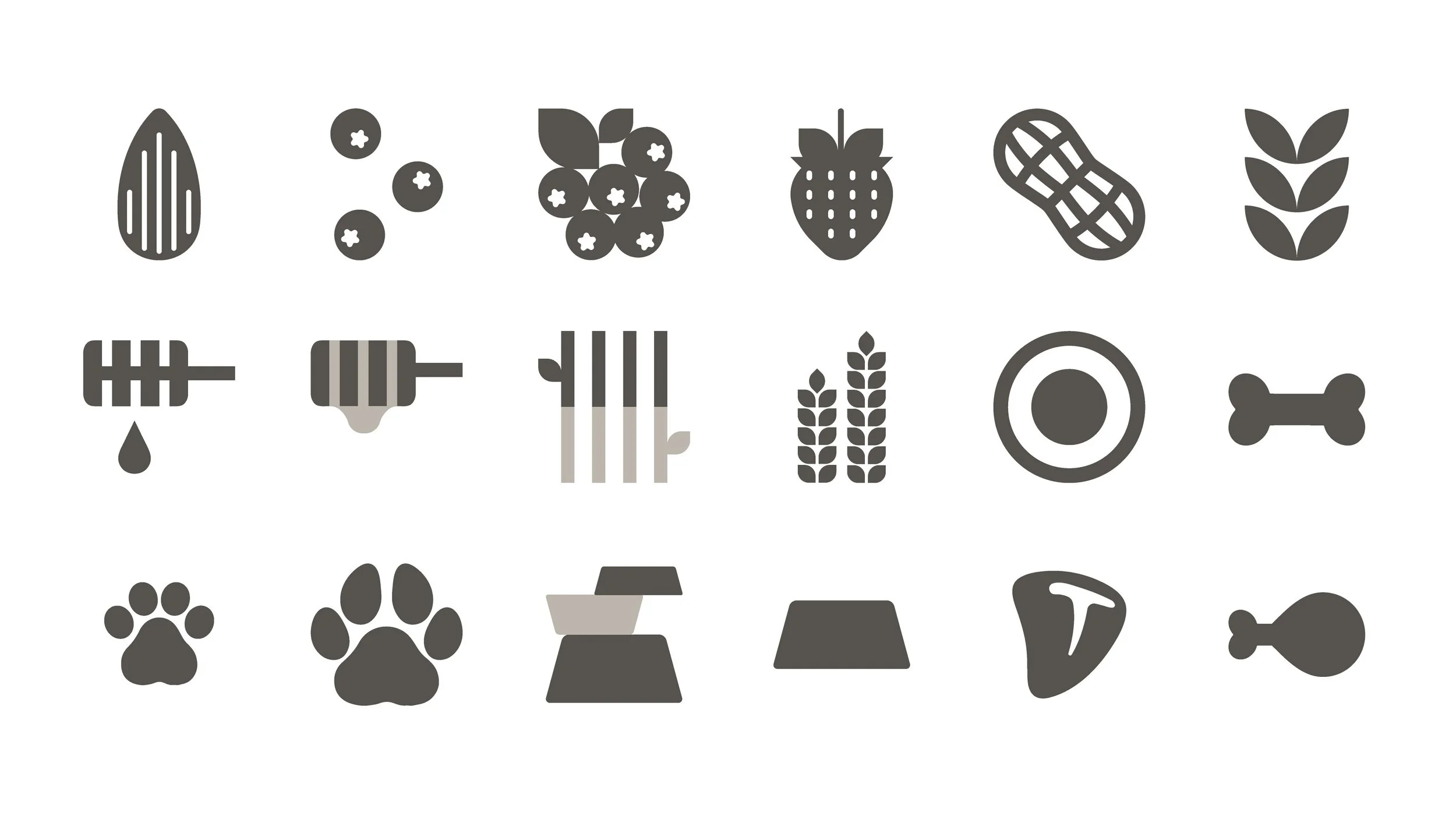
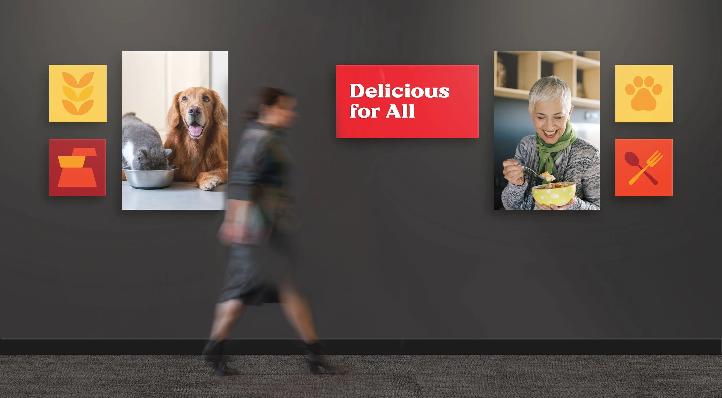
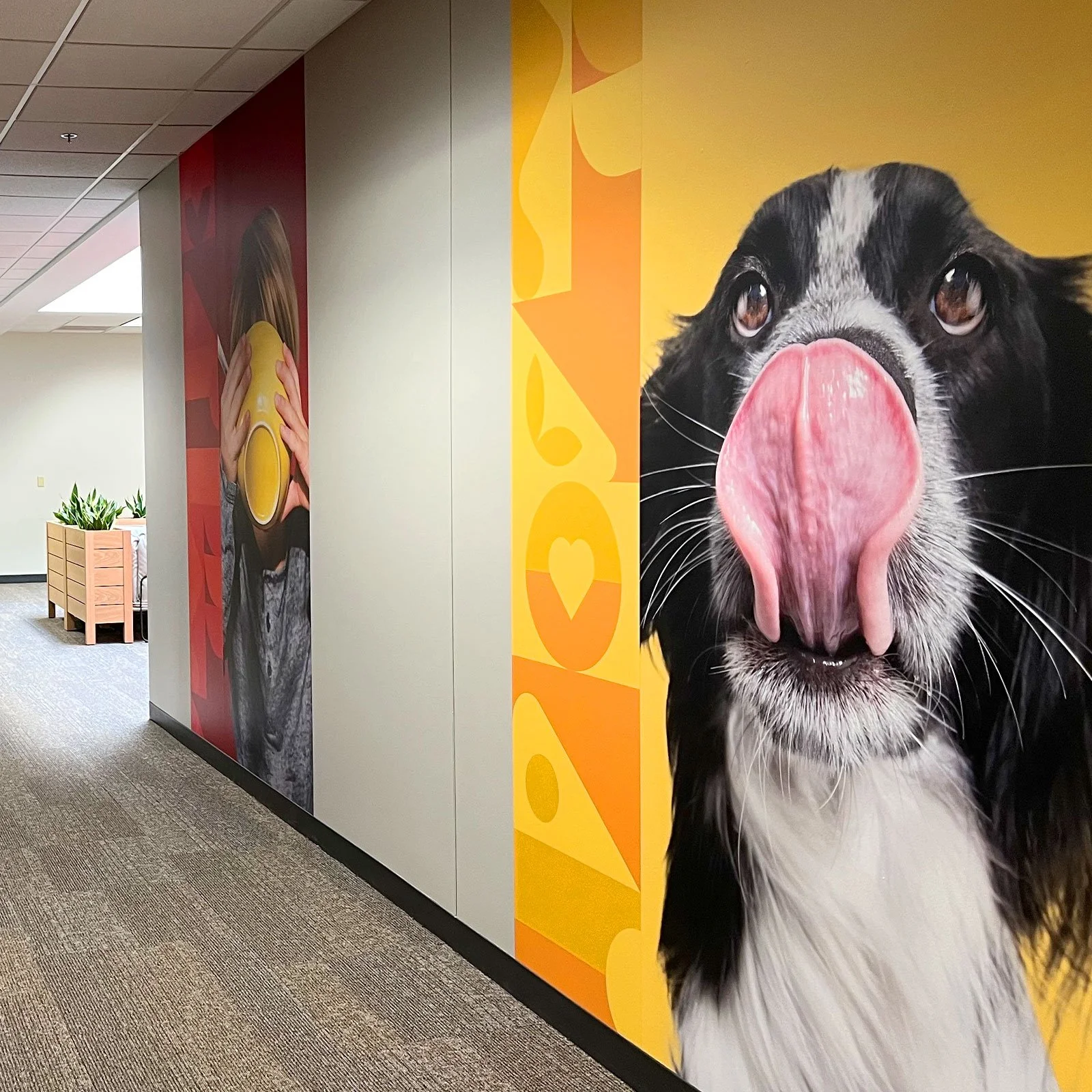
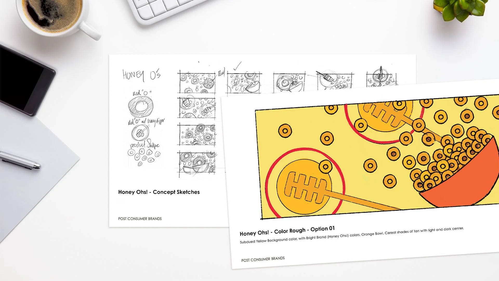
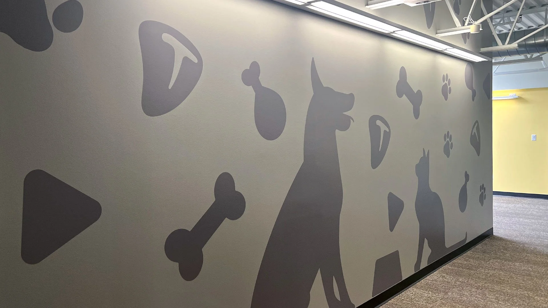
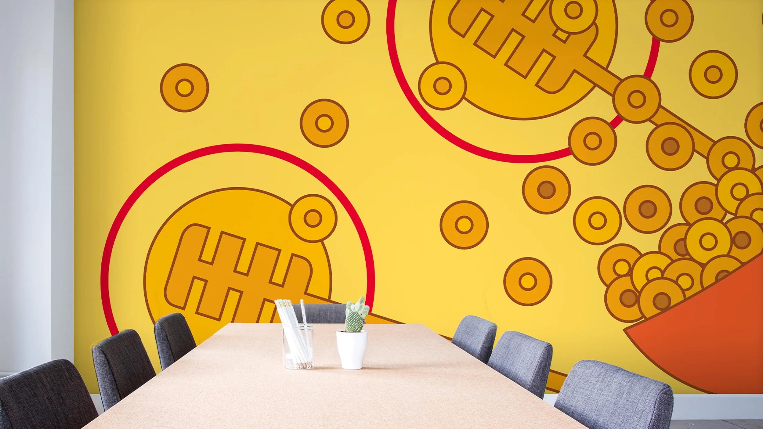
A set of custom icons were created to reflect Post products and to celebrate the ingredients used.
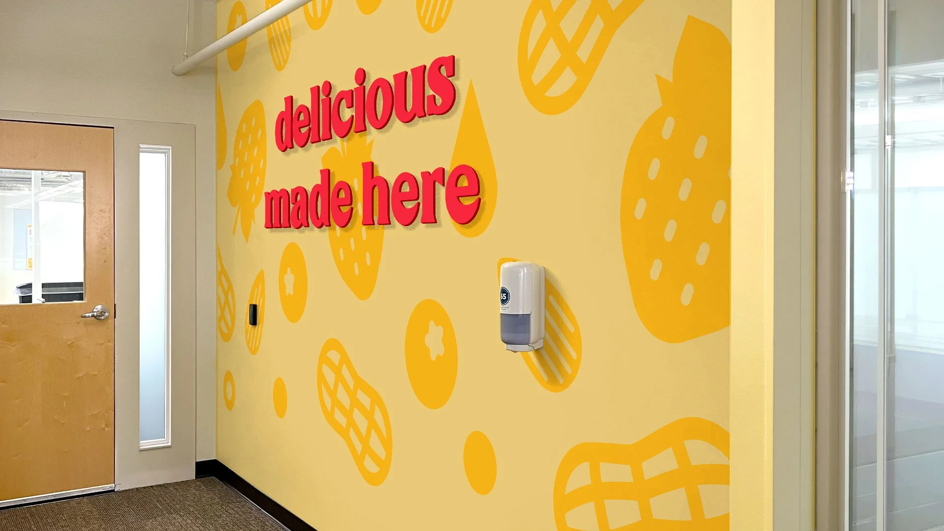
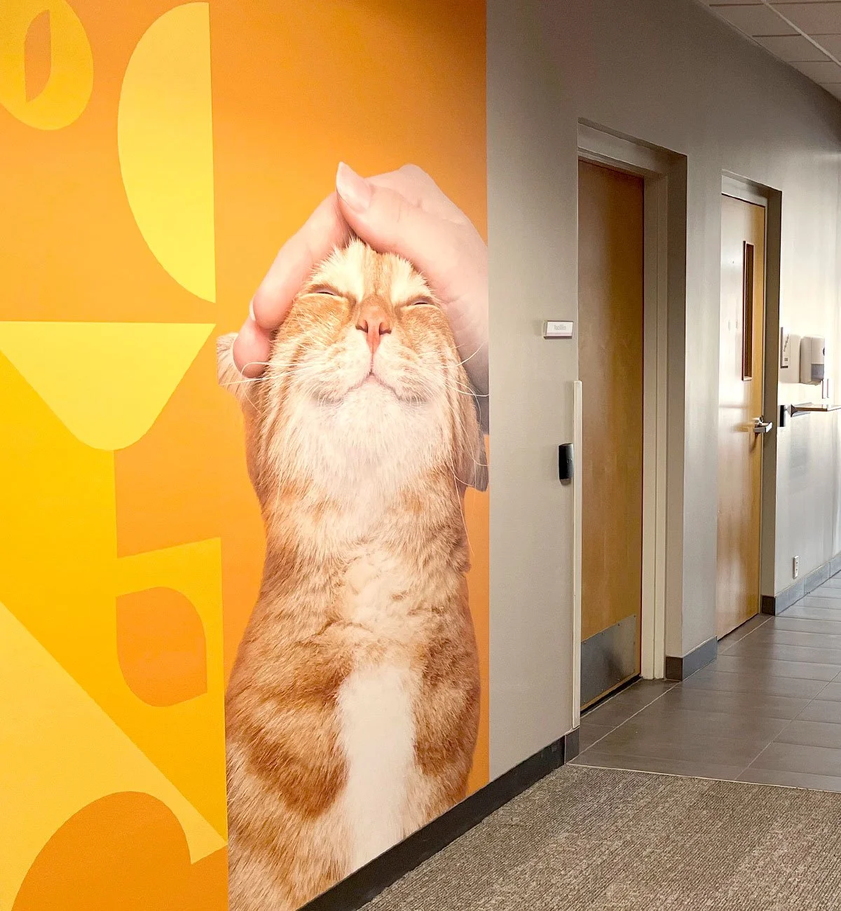
When applied to painted walls, the icons are super-sized and arranged into various compositions. This approach allows color and symbolism to work together by bringing energy, brand recognition, and visual consistency to common areas.
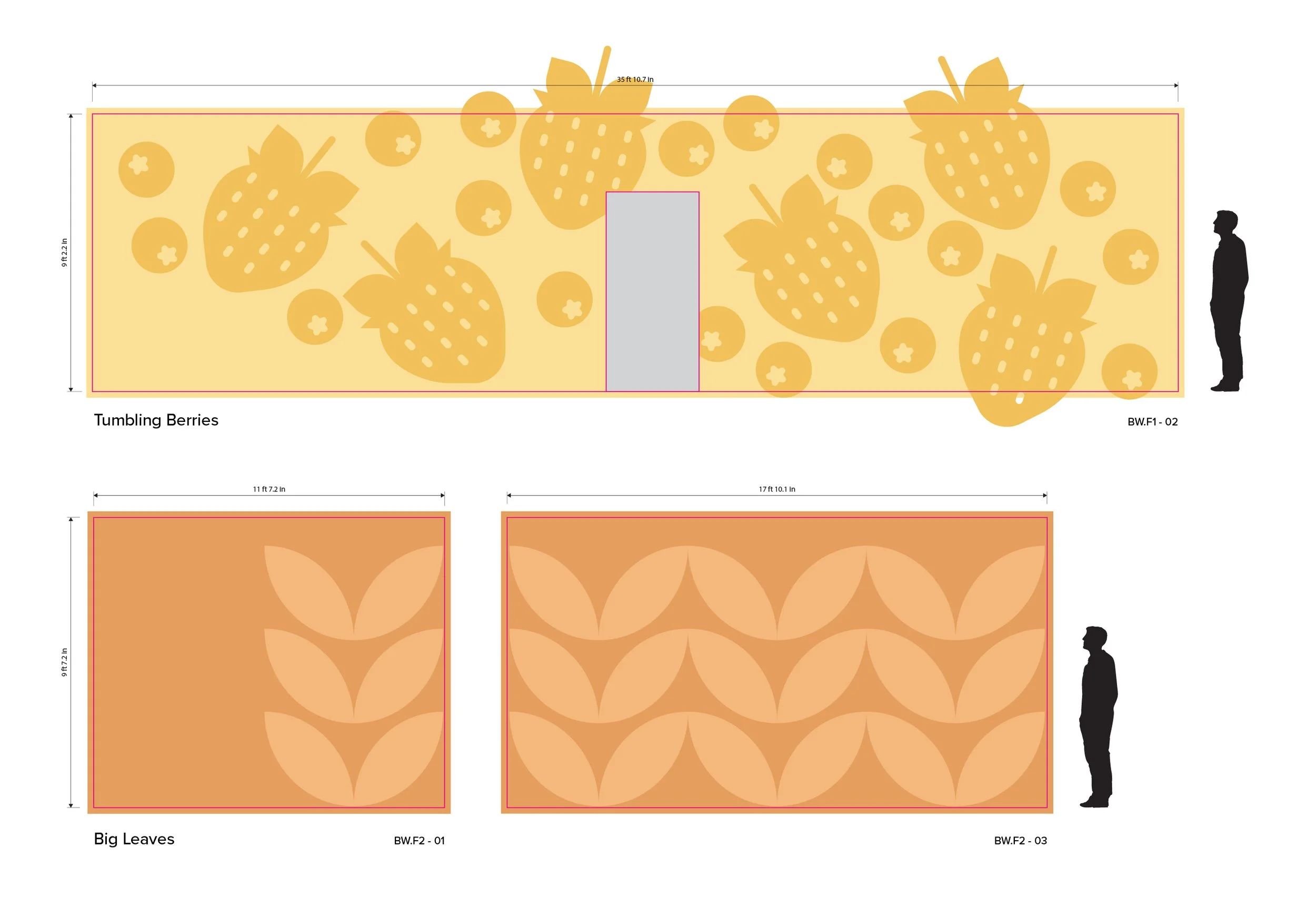
Early mural studies explored how product iconography and color could extend into large-scale interior moments, creating playful visual anchors that connected everyday brand elements to the workplace environment.
3.0 Fulfill
Carrying the experience through the workplace
This phase translated strategy into physical experience. Across the areas within our scope, the work introduced branded touchpoints that strengthened orientation, reinforced identity and carried a more cohesive experiential rhythm through the workplace.
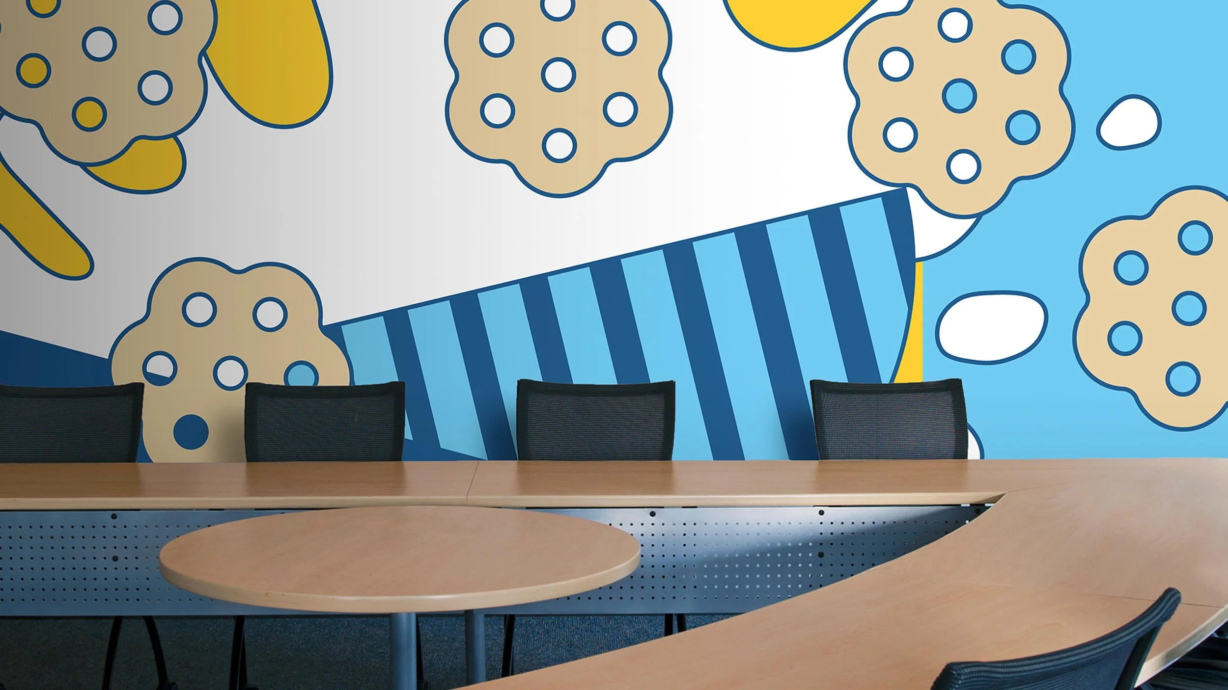
Conference rooms received large-scale murals celebrating key products, while huddle rooms introduced quieter graphics that support focus and collaboration. Stairwells were revitalized through color and simple visual cues that improve orientation and energy. We also addressed areas where the building lacked visual structure. Targeted environmental enhancements introduced artwork, privacy treatments and spatial graphics that resolved friction points without overwhelming the architecture.

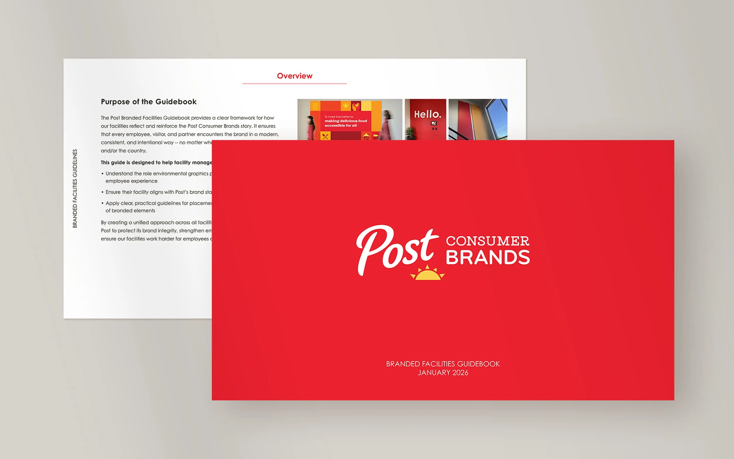
Branded facilities guidebook
The final system was documented in a comprehensive Experiential Design Guideline, allowing the strategy developed at headquarters to scale to future locations with clarity and consistency.
The Outcome
What changed was not decoration. It was the logic of the environment.
Brand, behavior and workplace environment were aligned into a single spatial system so the experience reads as intentional from the moment visitors enter the building. Circulation is clearer. Moments of emphasis feel purposeful. The brand is no longer a layer applied to the environment. It is part of how the workplace communicates.
The work brought greater clarity and cohesion to the campus by organizing brand elements into a more unified experiential system. In collaboration with RSP Dreambox, Hiarki contributed to the project’s development, experiential framework, design precision and implementation thinking, helping turn disconnected branded moments into a more intentional workplace experience.
The result is a workplace that feels cohesive today and adaptable tomorrow. The strategy was codified into a guideline that allows the experience to scale across future Post locations without losing the clarity established at headquarters.
Next Project
Looking for a design partner?

If you’re working on a project where brand, architecture, and experience need to align, we’d love to collaborate.