
Kita Music
Building a simple identity for young musicians in the making
The Project
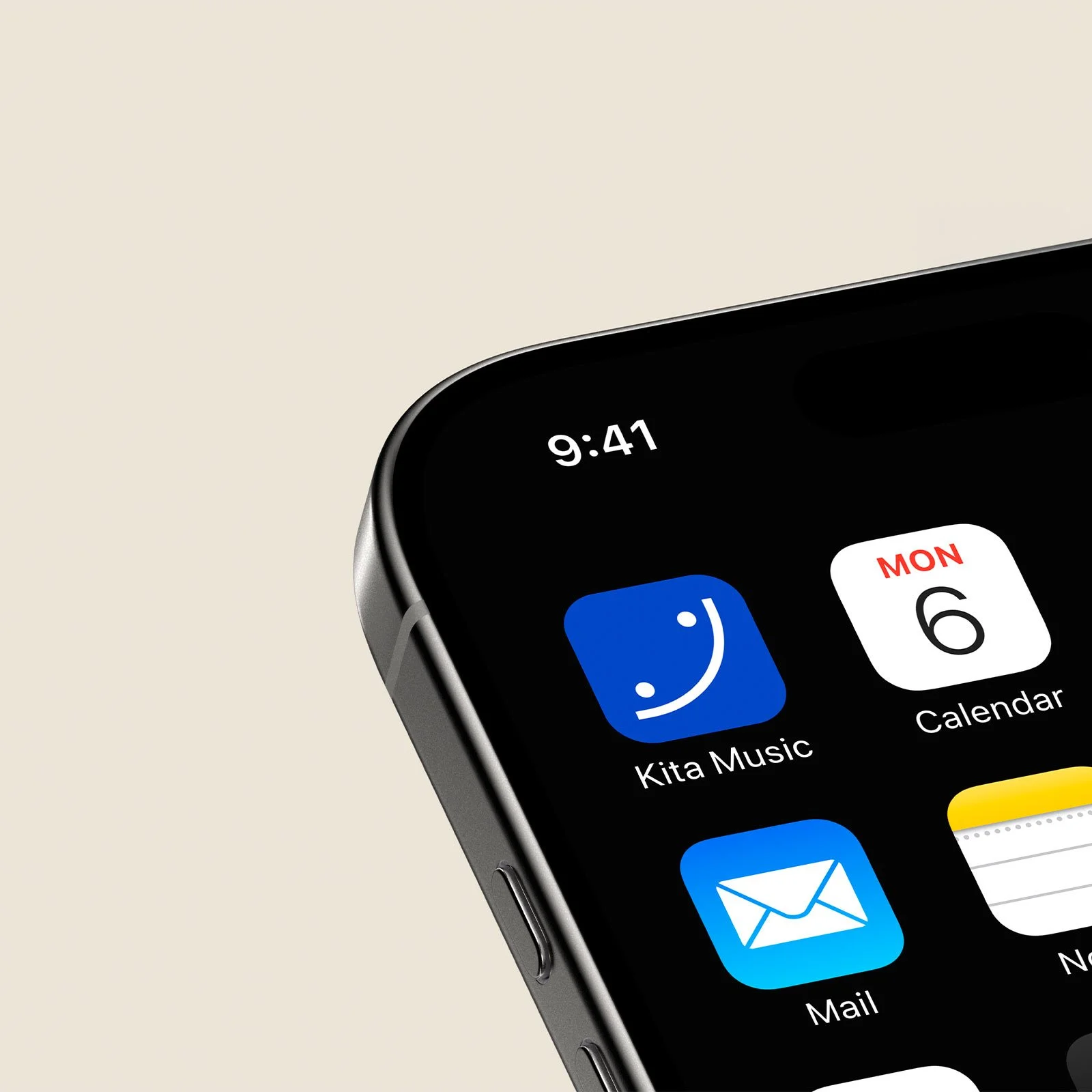
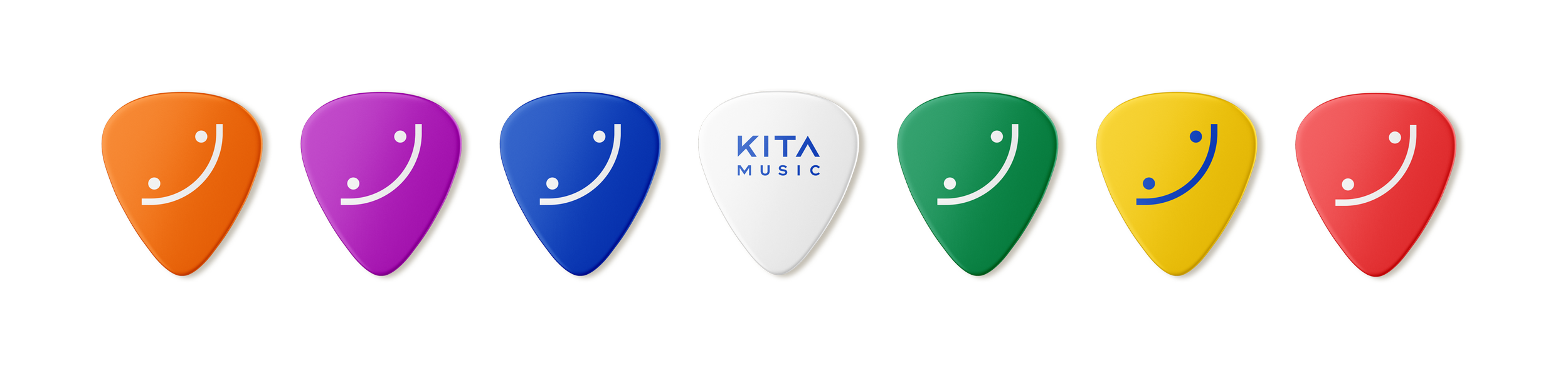
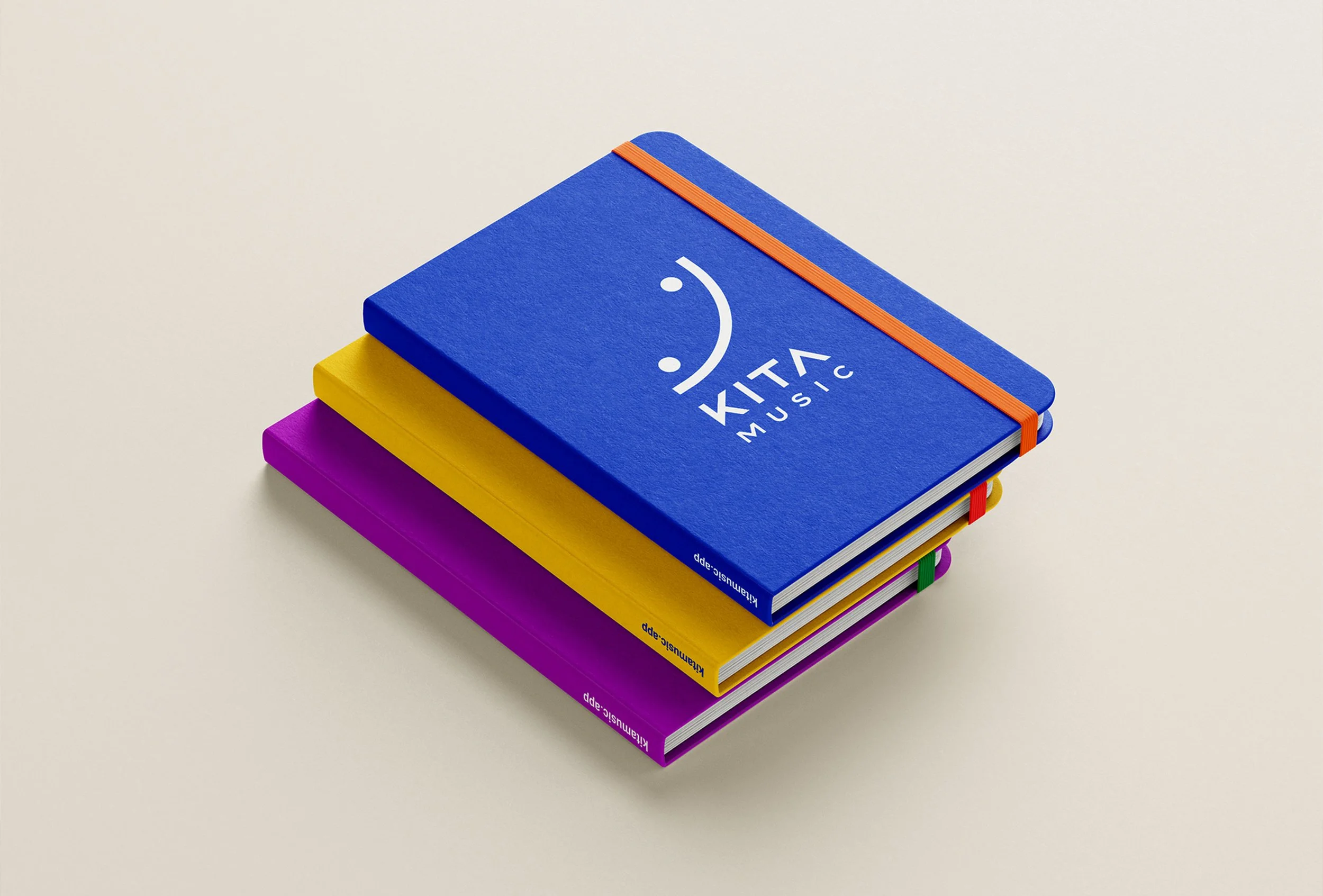
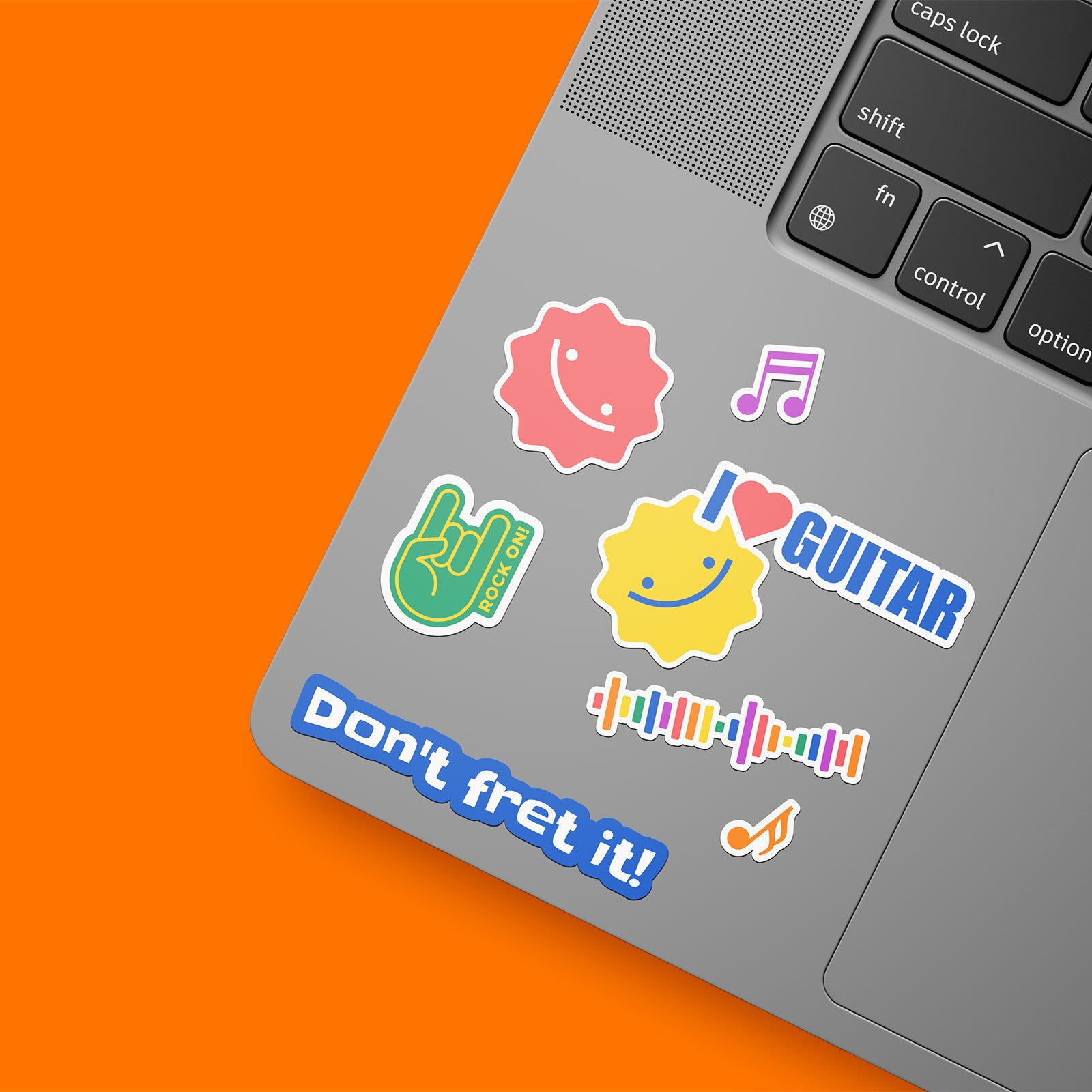
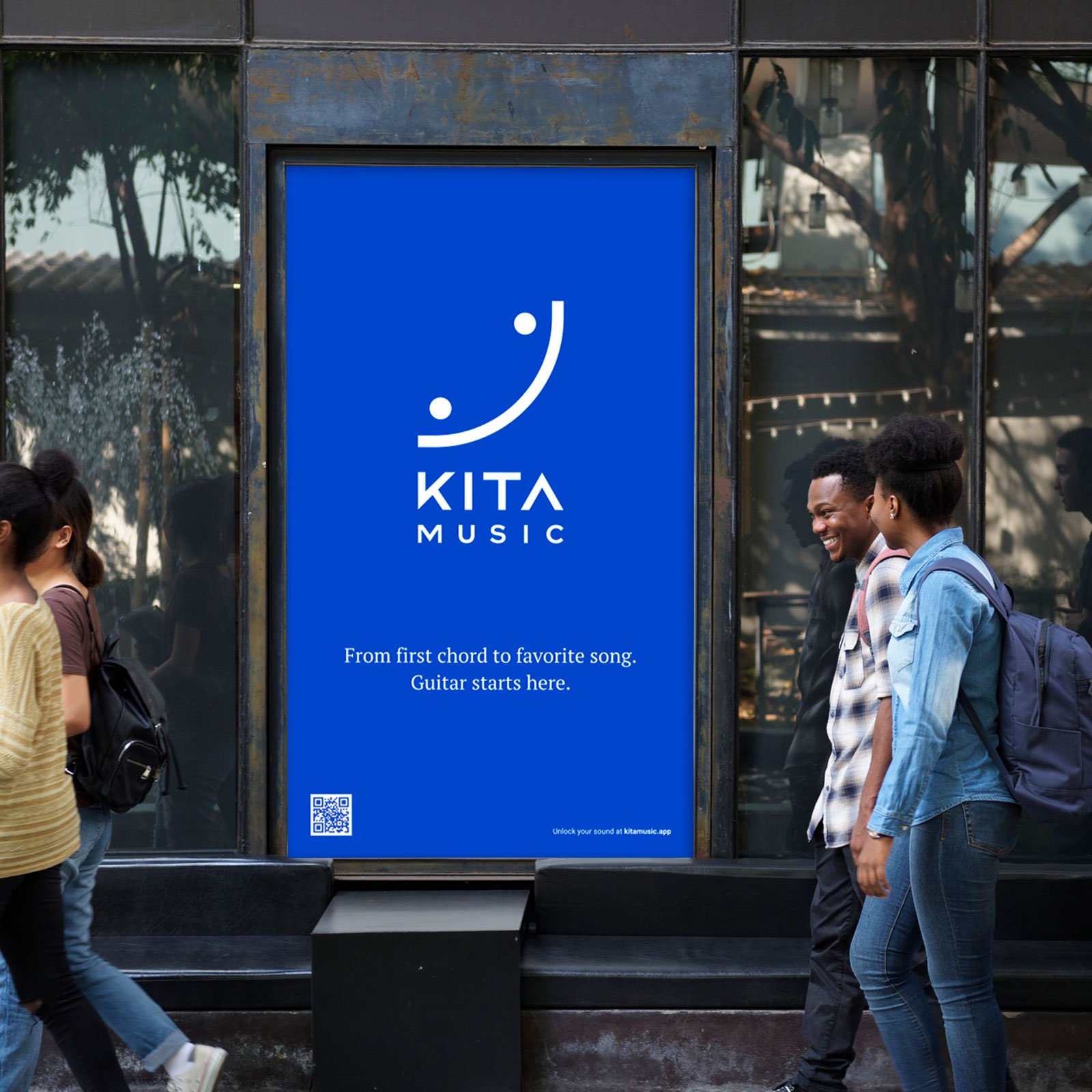
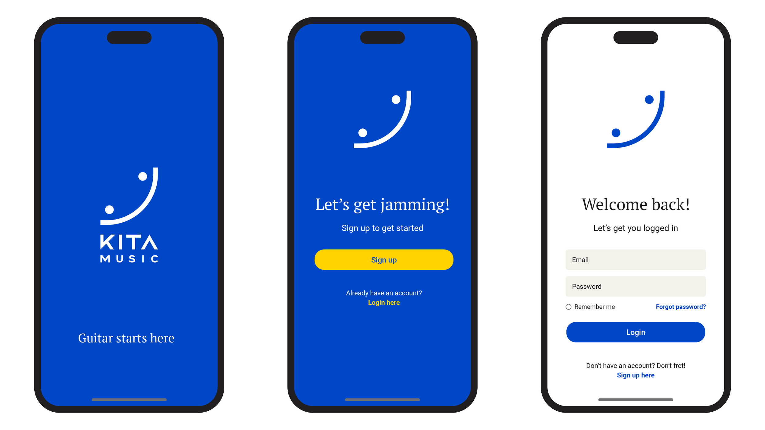
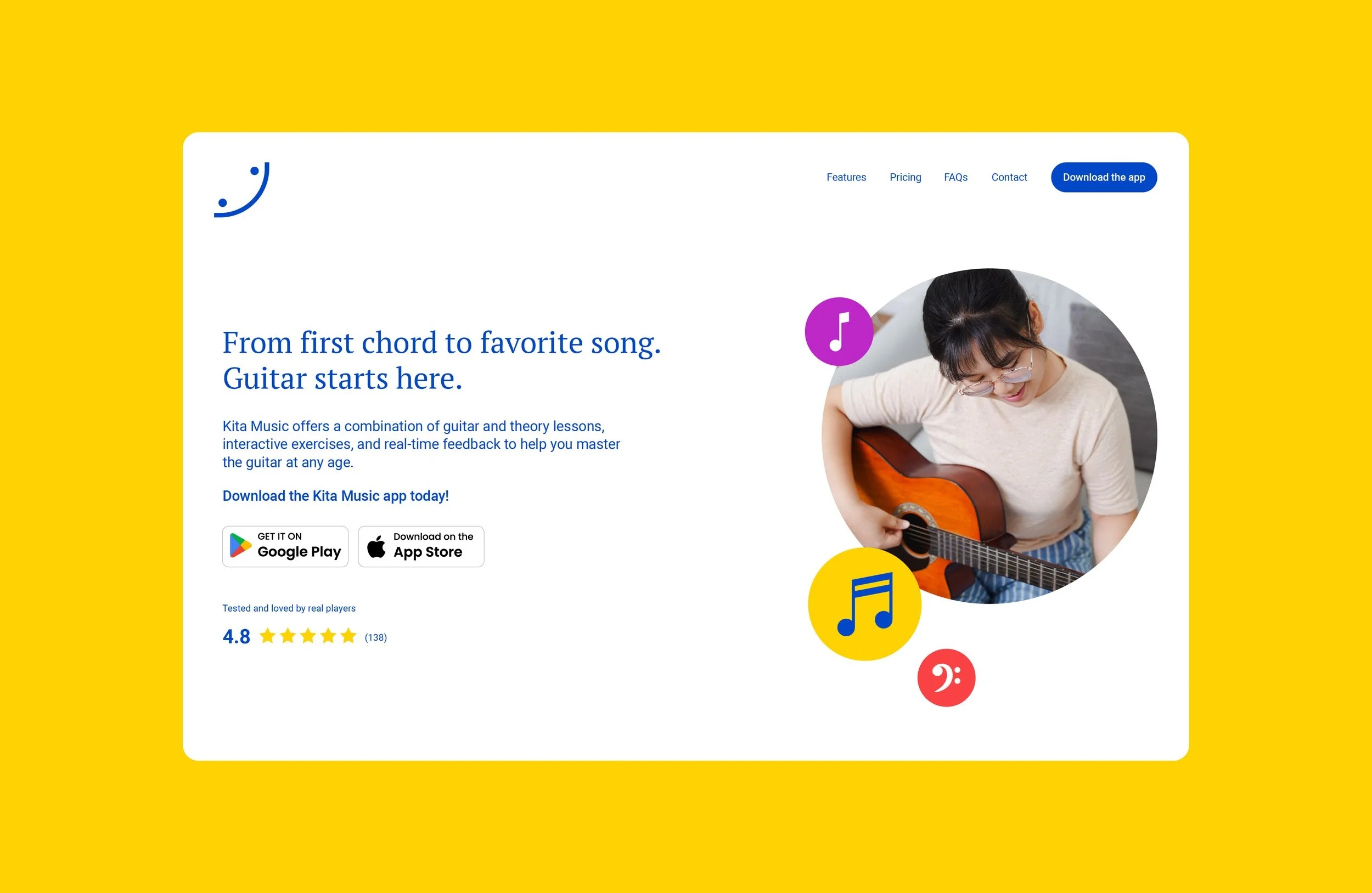
This concept identity was developed for a digital learning app designed to introduce children and young teens to guitar through a playful, approachable experience. The goal was to create a visual language that felt simple and memorable while reflecting both music and early learning. The resulting mark uses minimal geometric forms to suggest a smiling face and a musical gesture at once, creating a brand that feels friendly, recognizable and easy to extend across digital touchpoints.
Hiarki Services
Creative & Design
Logo Design
Brand Identity
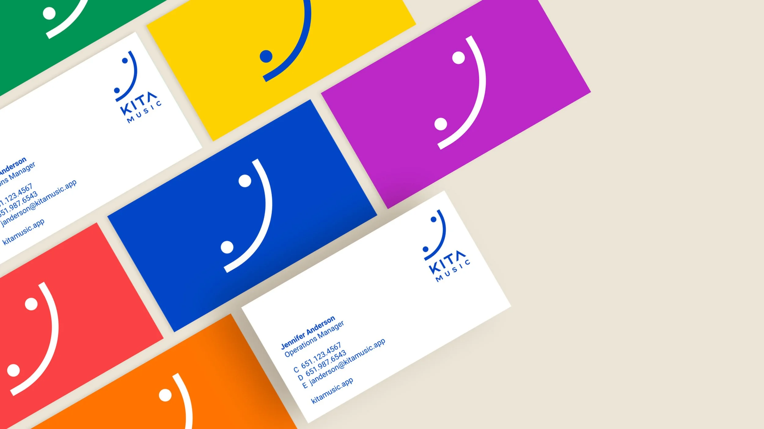
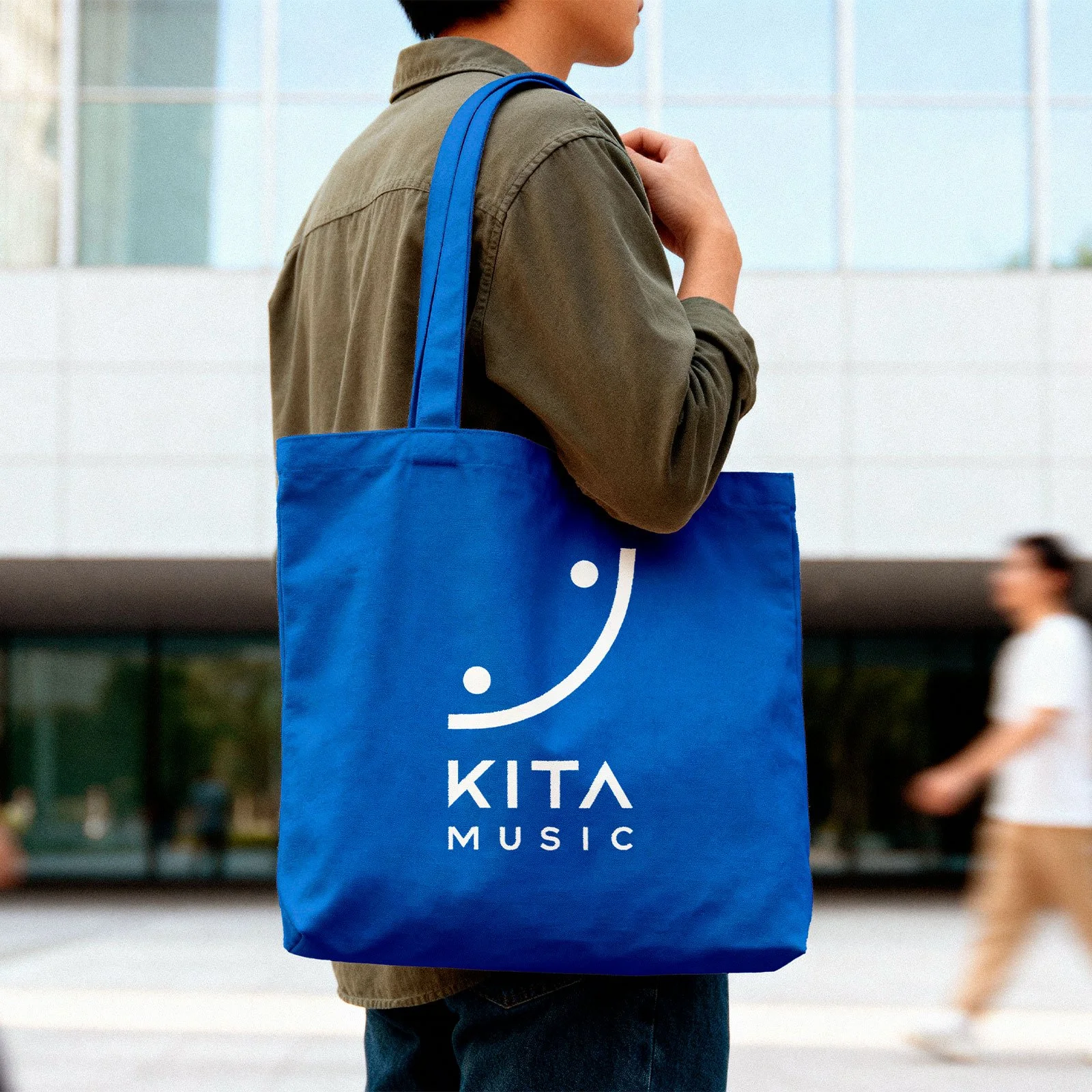
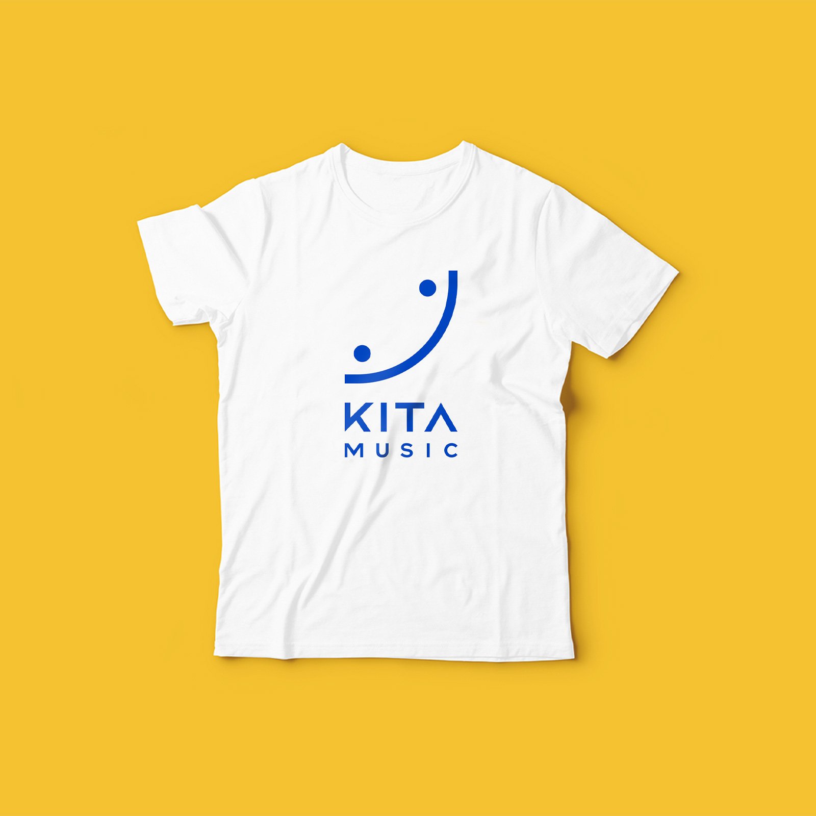
Collateral Design
Project Details
Industry:
Educational Technology
Timeframe:
3 months
The Challenge
Children’s learning products often compete for attention in crowded digital environments, where visual identity needs to communicate trust, fun and clarity immediately. For a music-focused app, the challenge was balancing educational credibility with a tone that felt welcoming rather than instructional. The identity needed to avoid clichés often associated with music education while still subtly referencing rhythm, sound and interaction.
The Outcome
The final logo system centers on a minimal symbol that combines expressive character with strong visual simplicity. Its curved form suggests movement and musical flow, while the dot elements introduce personality and warmth. Paired with a bold color palette, the identity establishes a clear digital presence that can scale easily across app interfaces, onboarding moments and promotional materials. The result is a concept brand designed to feel joyful, modern and immediately accessible to young learners and their families.
Looking for a design partner?

If you’re working on a project where brand, architecture, and experience need to align, we’d love to collaborate.